Hey! I’m an Art Director specializing in Brand Design and Typography. I create longlasting brands and memorable campaigns that attract a following. Contact me with any questions or collaborative opportunities.
︎ ︎
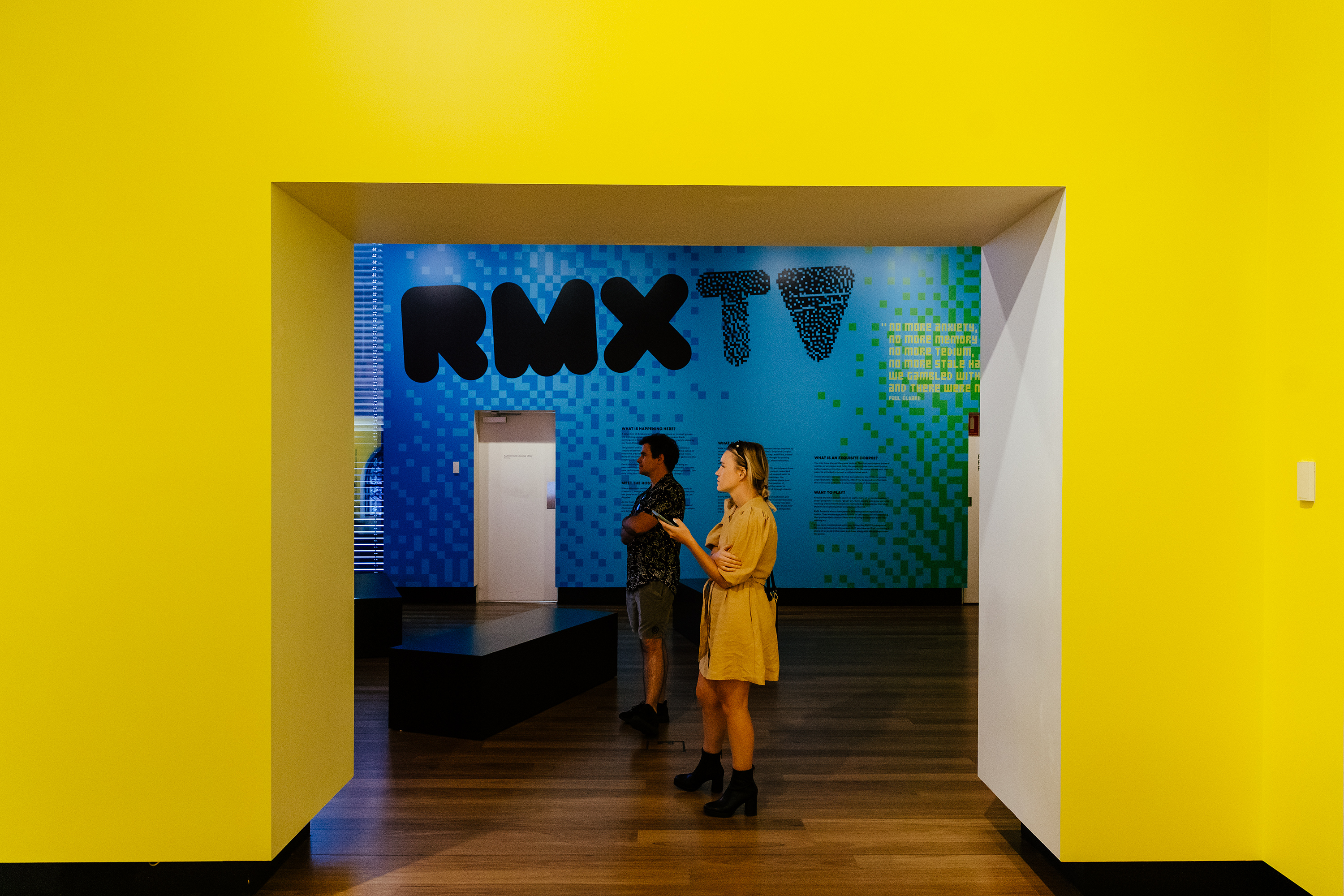
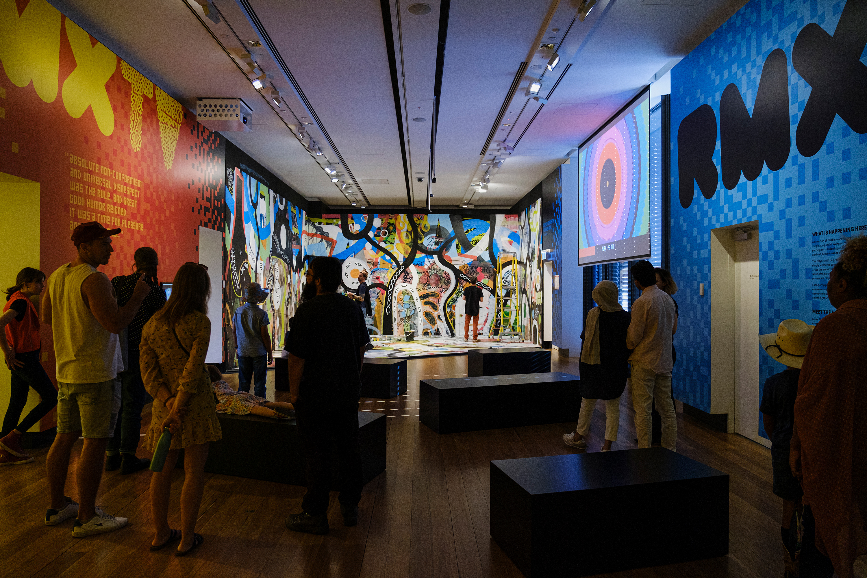
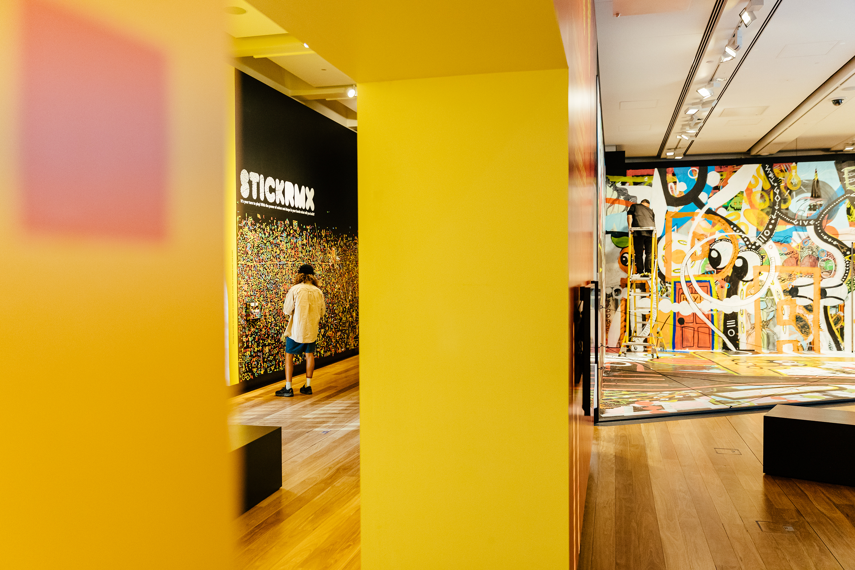
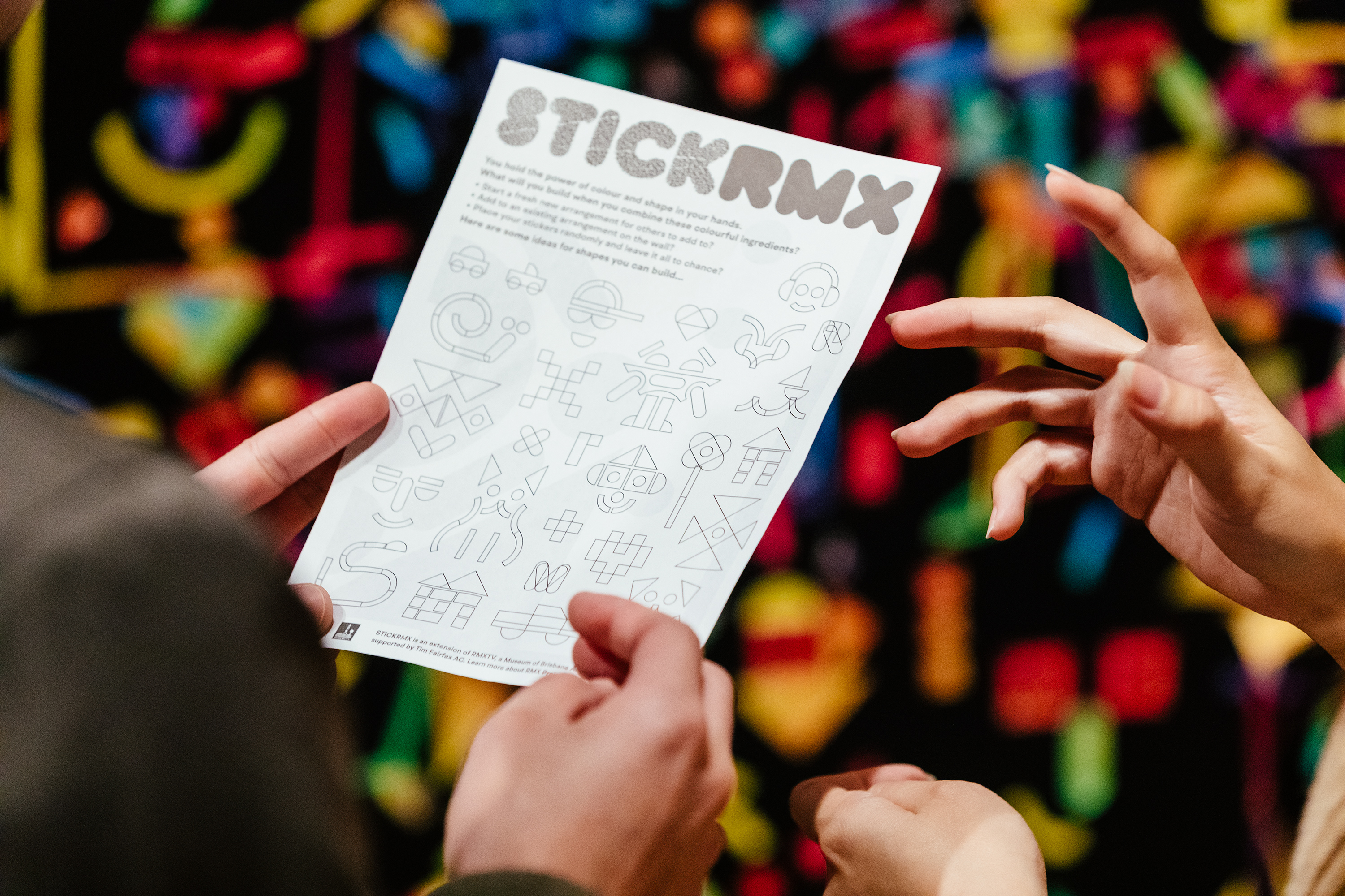
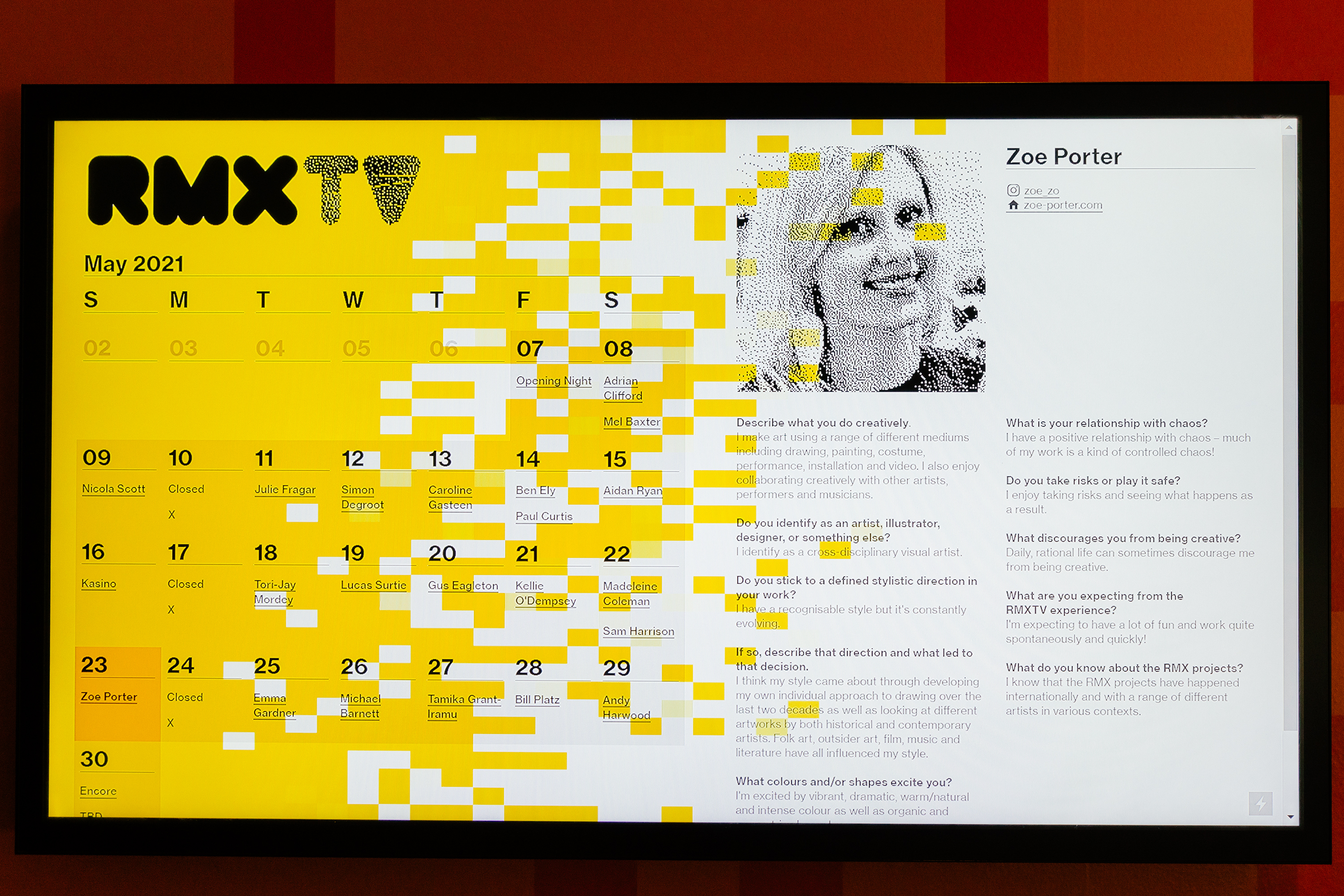
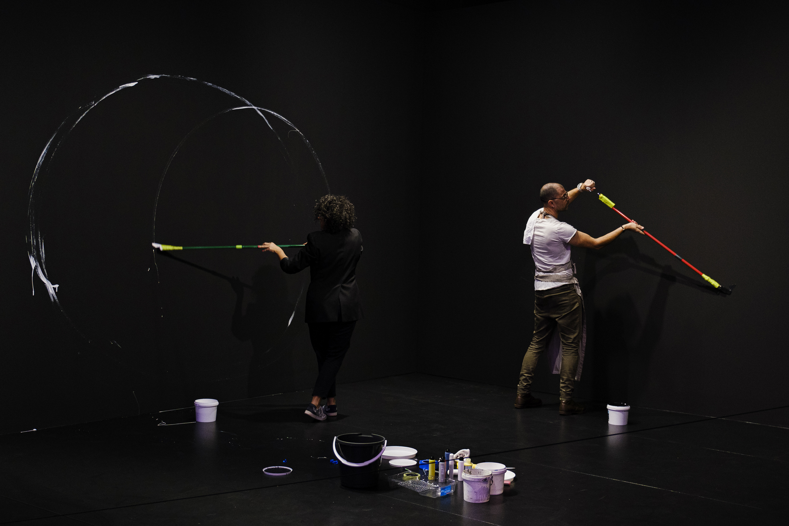
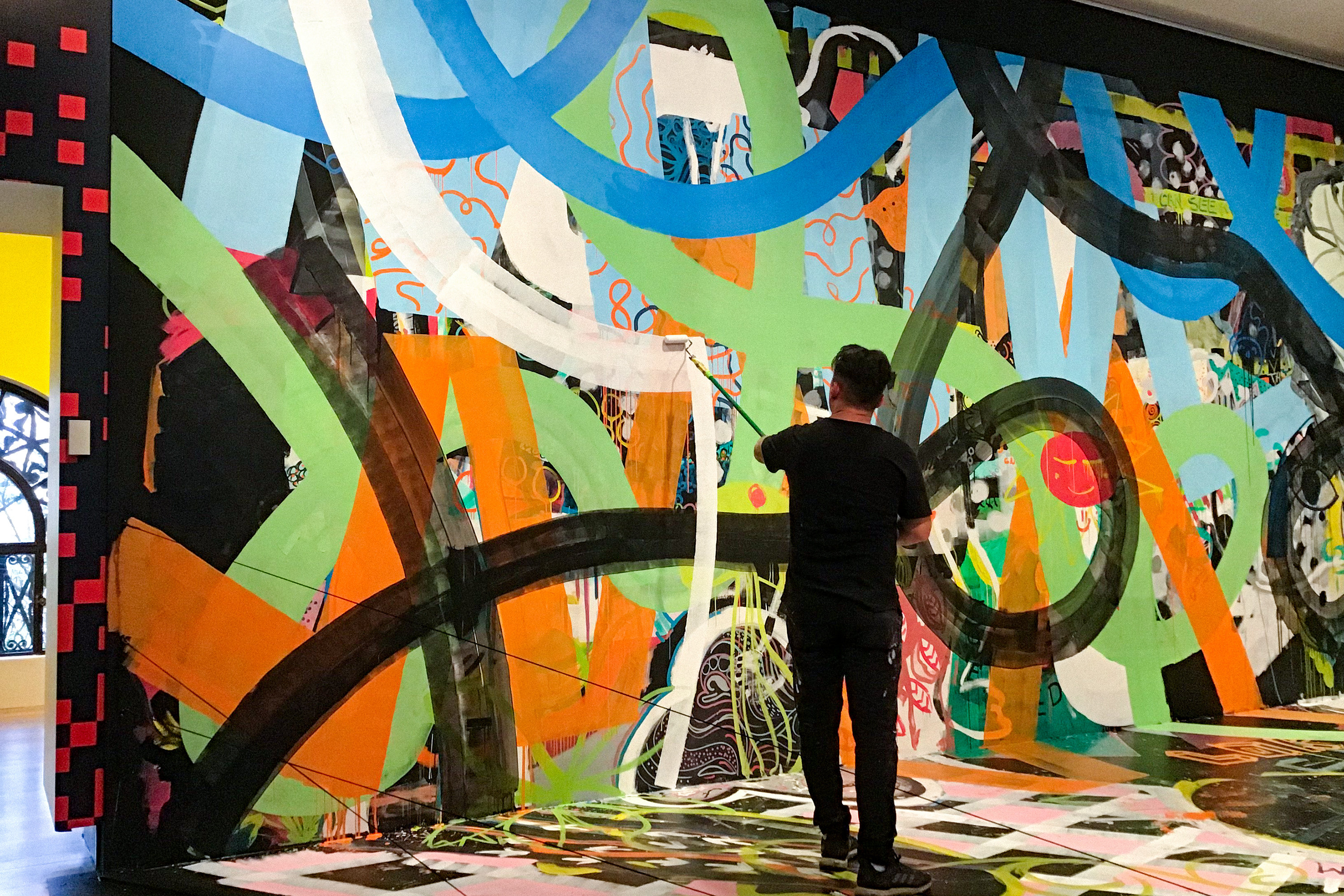
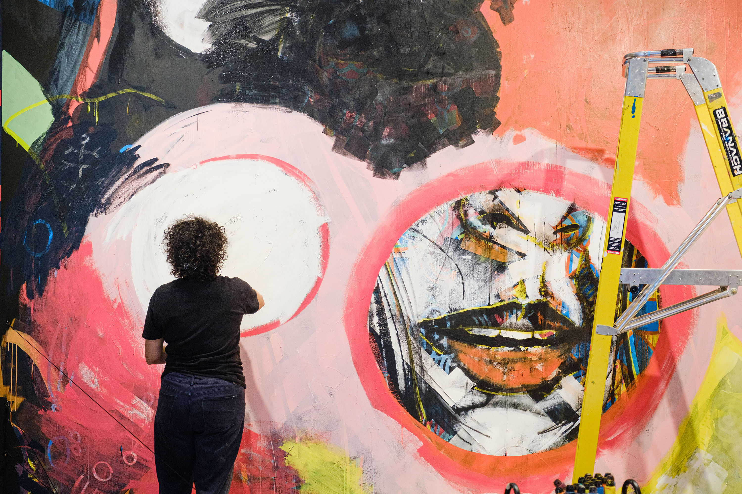
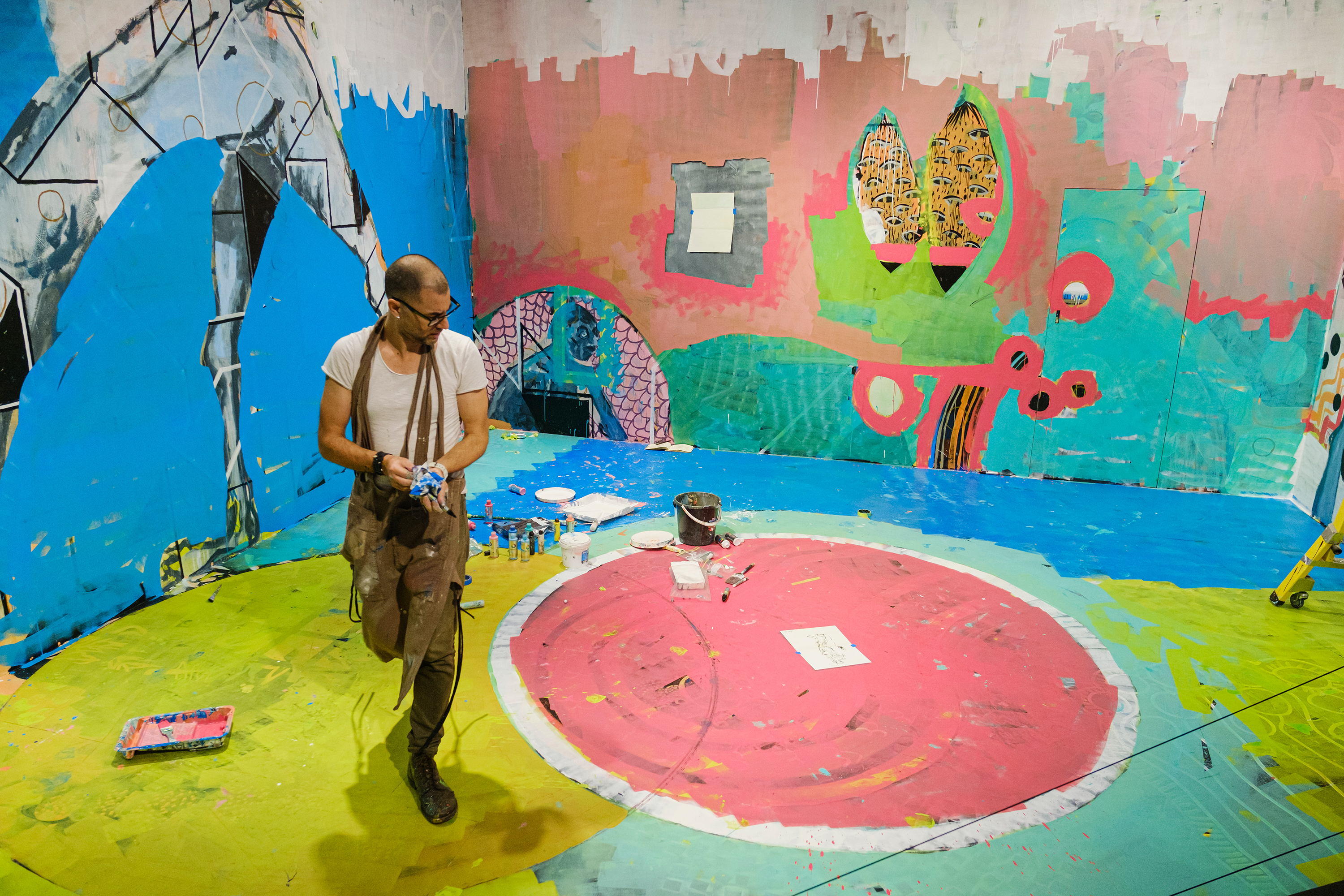
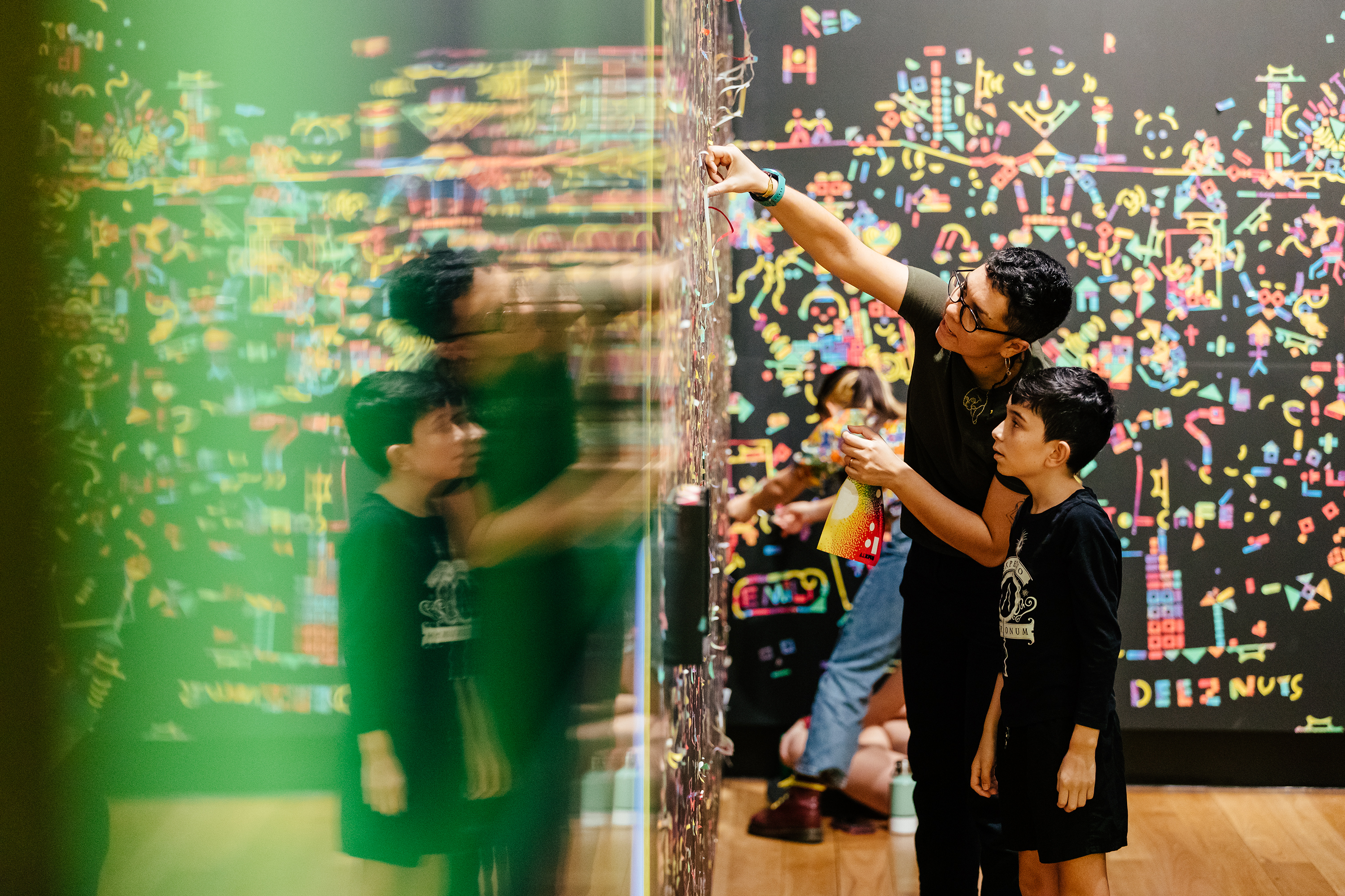
RMXTV
The RMXTV event, hosted by the Museum of Brisbane, featured 23 artists following a series of prompts to transform the stage over the course of a month. RMX is an ongoing series of collaborative art projects and workshops that started in 2000. I selected, briefed and scheduled the artists, and designed the space, branding and marketing materials. I also produced a four hour video featuring my own animation, music and voice over to deliver the prompts and entertain the artists and audience. Throughout the project I edited photos and timelapse videos daily. All of this work was completed remotely from Los Angeles. See more RMX Projects here.
Art Direction
Branding
Exhibition Layout
Experiential Design
Artist selection and engagement
Project management
Website design & implementation
Image editing
Video editing
Motion graphics
Branding
Exhibition Layout
Experiential Design
Artist selection and engagement
Project management
Website design & implementation
Image editing
Video editing
Motion graphics


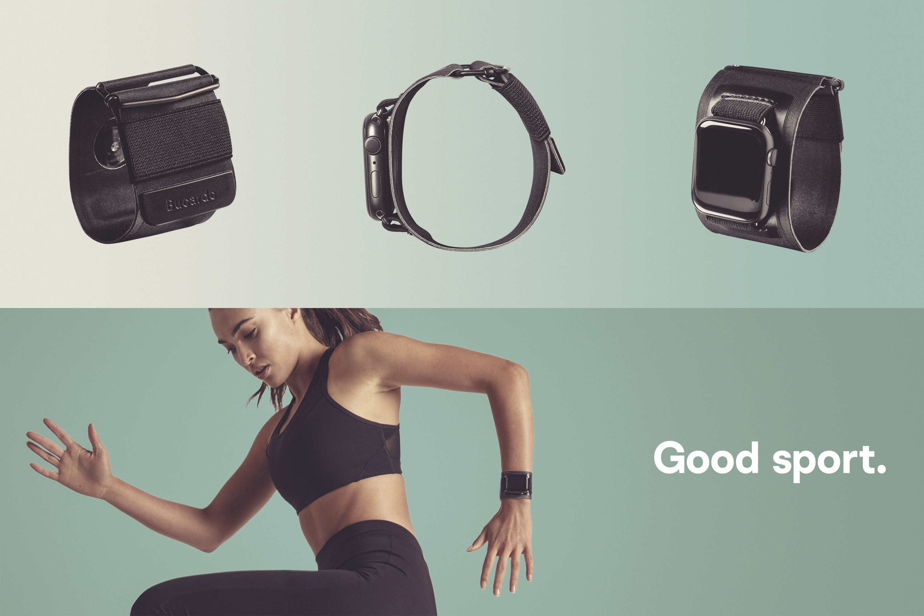
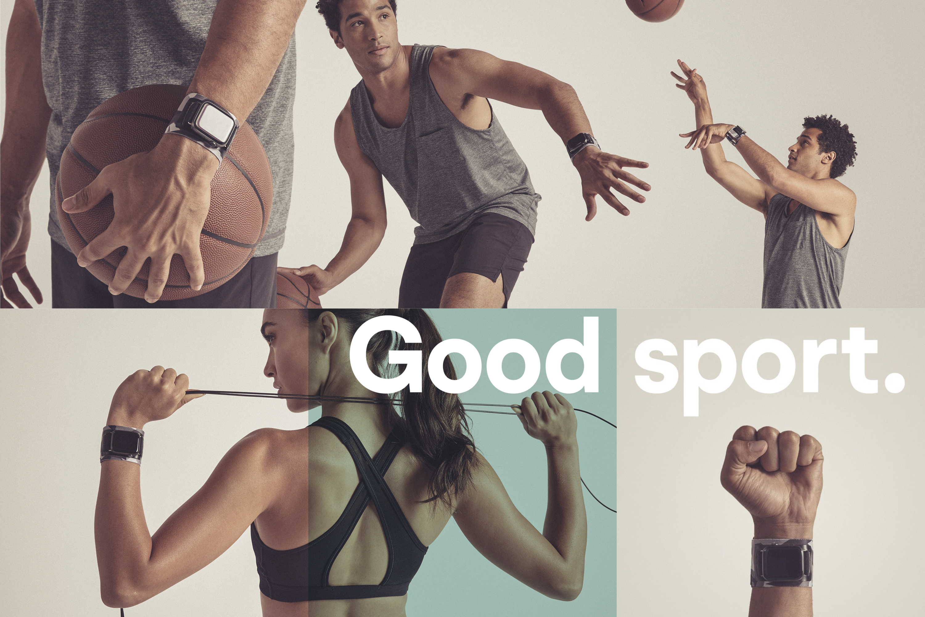
Bucardo
I developed the visual campaign and packaging for the launch of the new Bucardo sports band for the Apple watch. Working with a minimal budget during the pandemic, I was able to produce a full range of quality promotional materials and a slick packaging solution that was easy to construct without glue.
Art direction
Campaign strategy
Photographic direction
Packaging
Retouching
Color grading
Social Media plan
Campaign strategy
Photographic direction
Packaging
Retouching
Color grading
Social Media plan


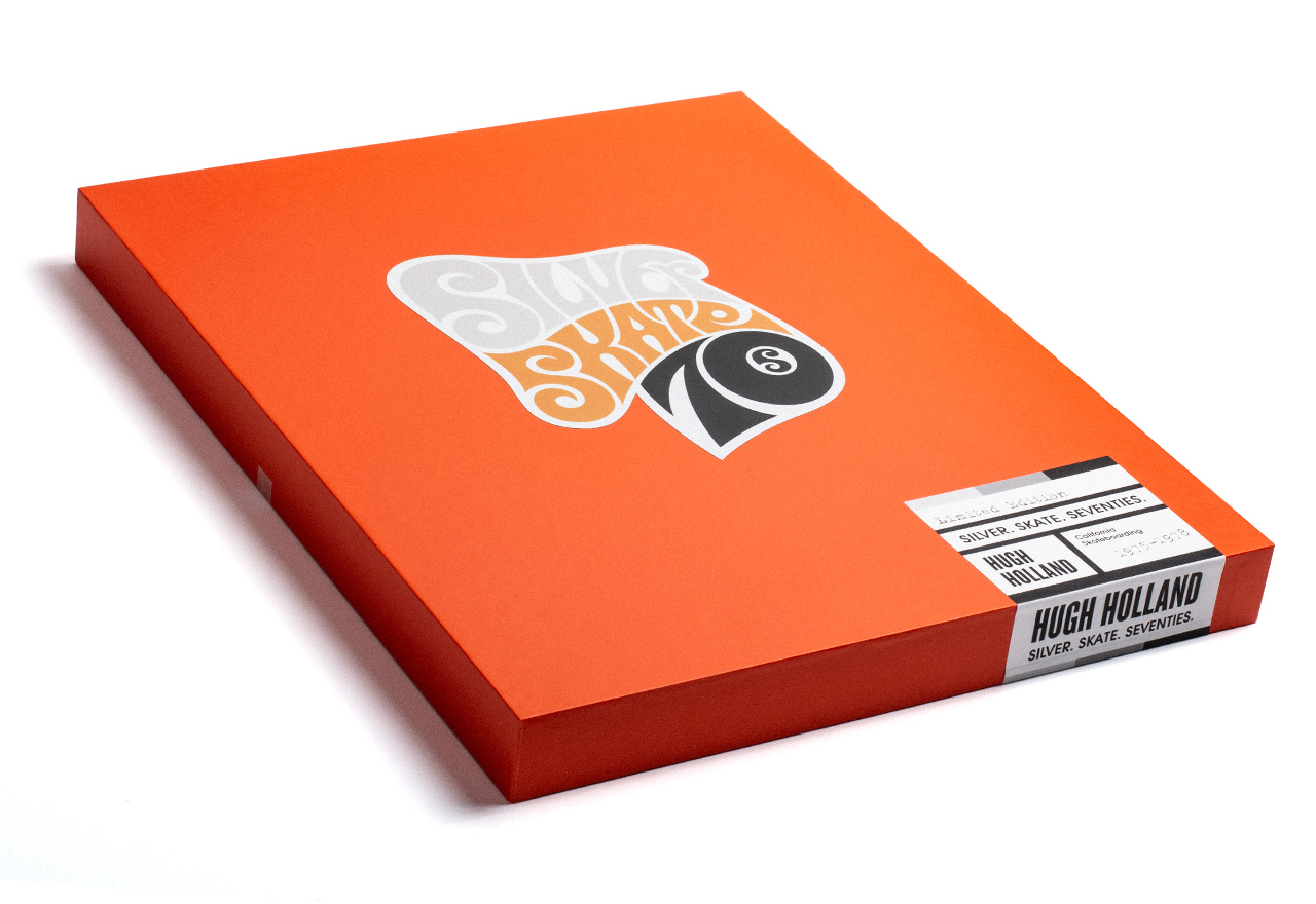
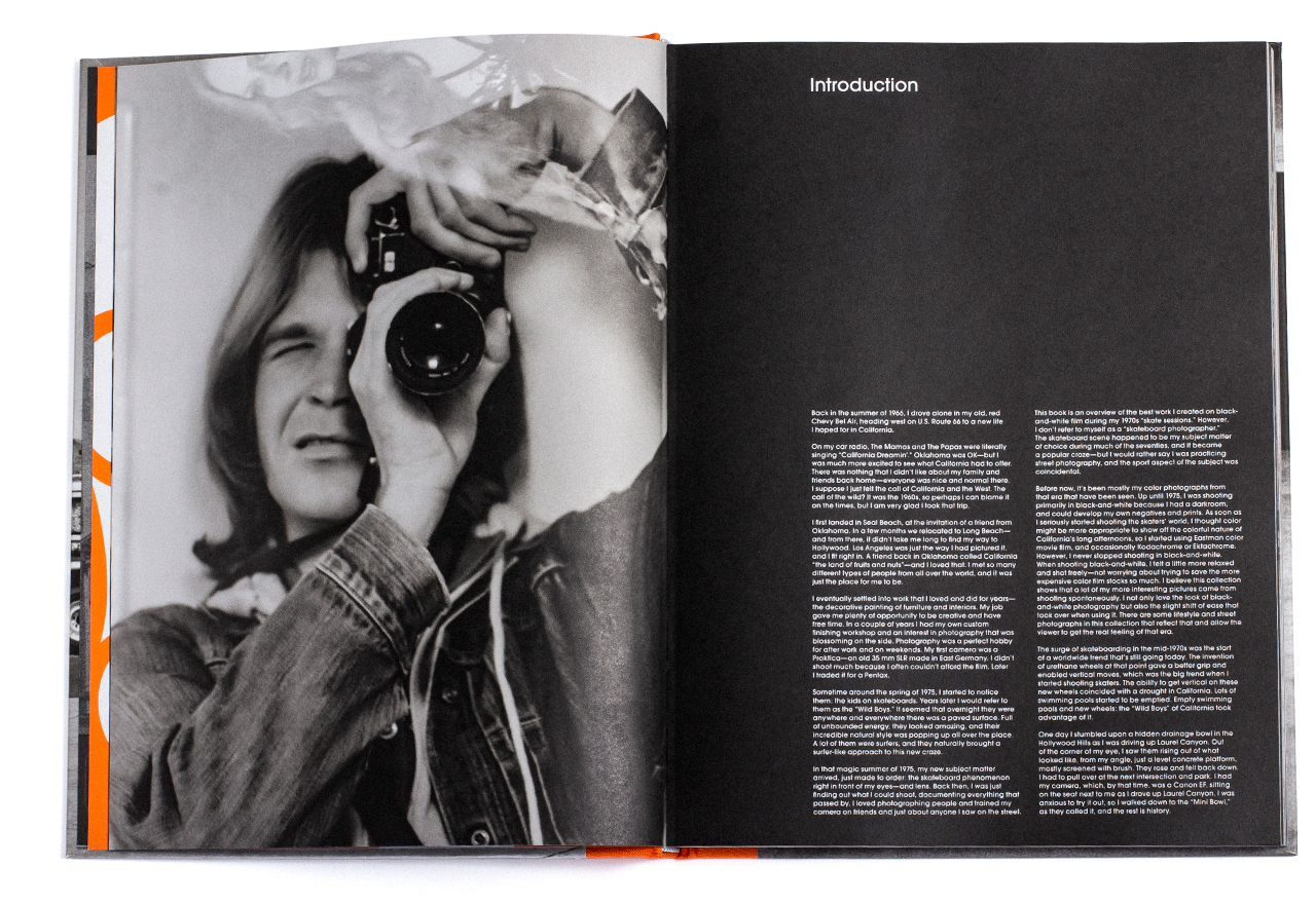
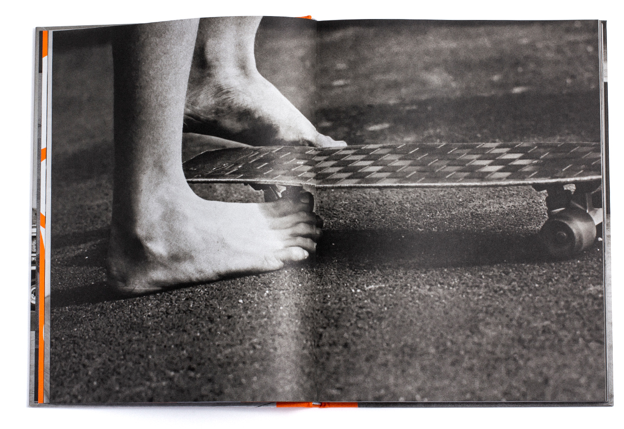
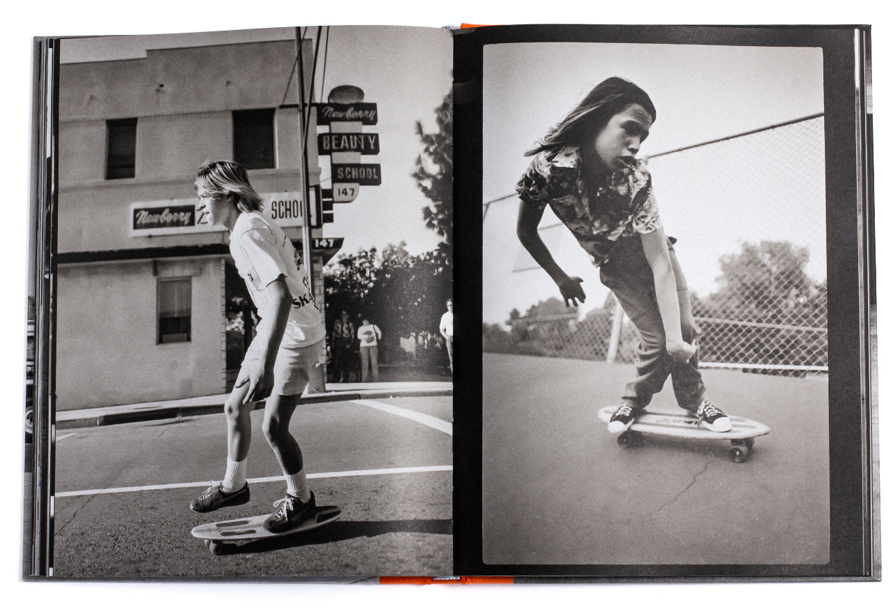
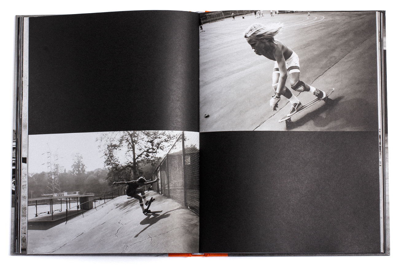
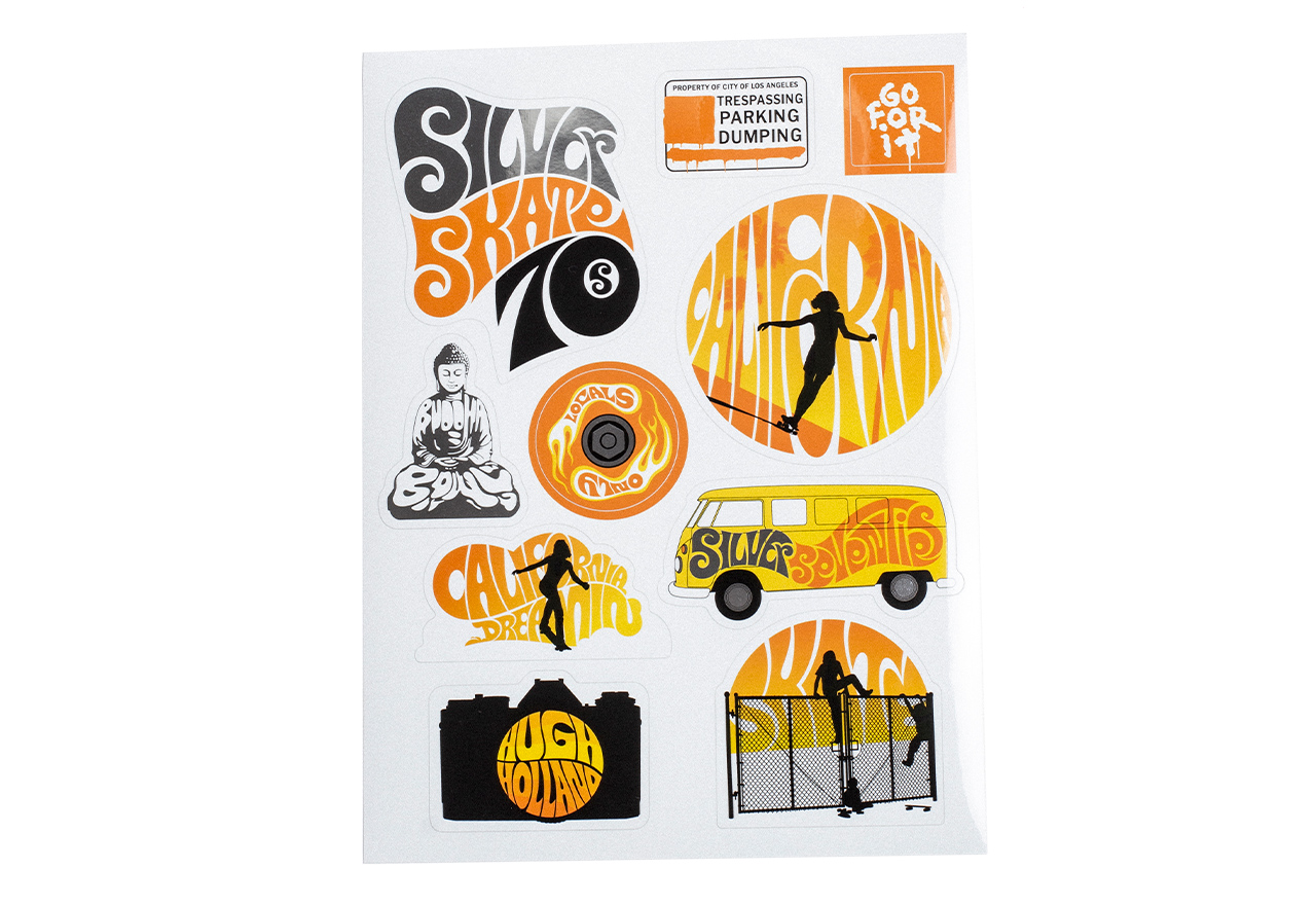
Silver Skate Seventies
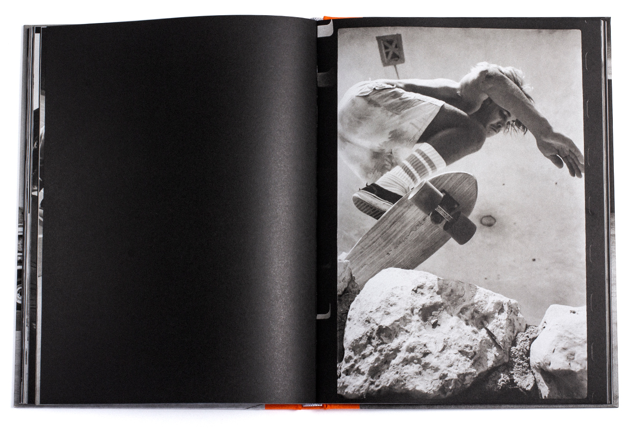
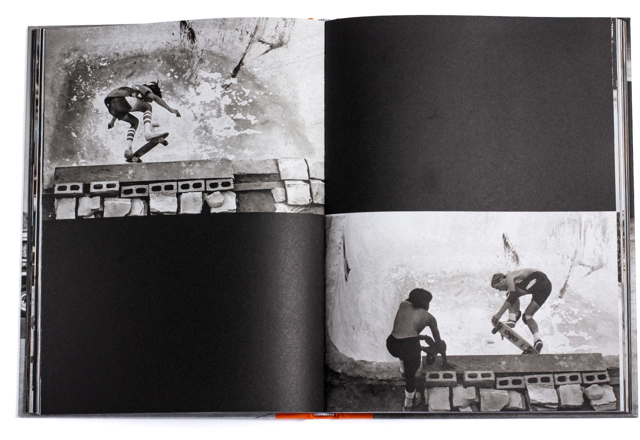
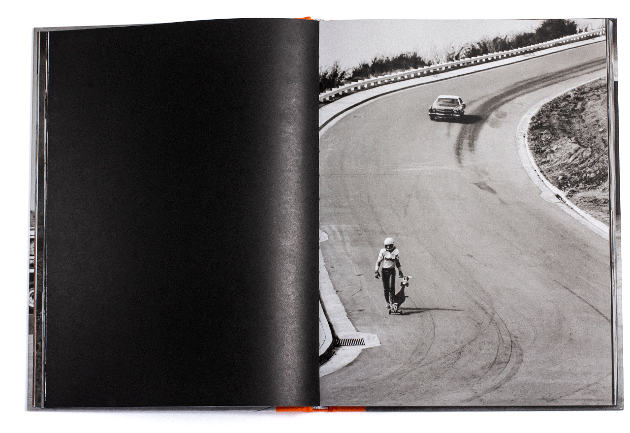
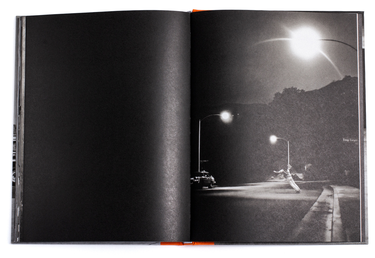
For this never-before-published collection of Hugh Holland’s black-and-white photographs documenting young Californian skateboarders, I designed a title reminscent of popular 70’s music posters. The special edition is housed in a box similar to an original Agfa photographic paper package complete with a sticker sheet full of graphic references to the book’s content. I retouched many of the images to remove dust, scratches and damage that had occurred over time.
Custom Typography
Layout
Sticker sheet illustrations
Packaging
Retouching


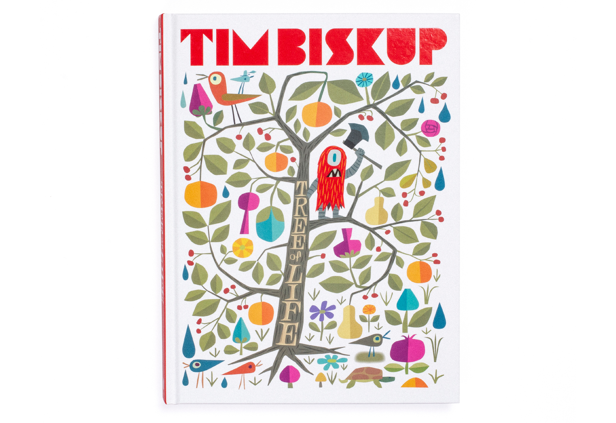
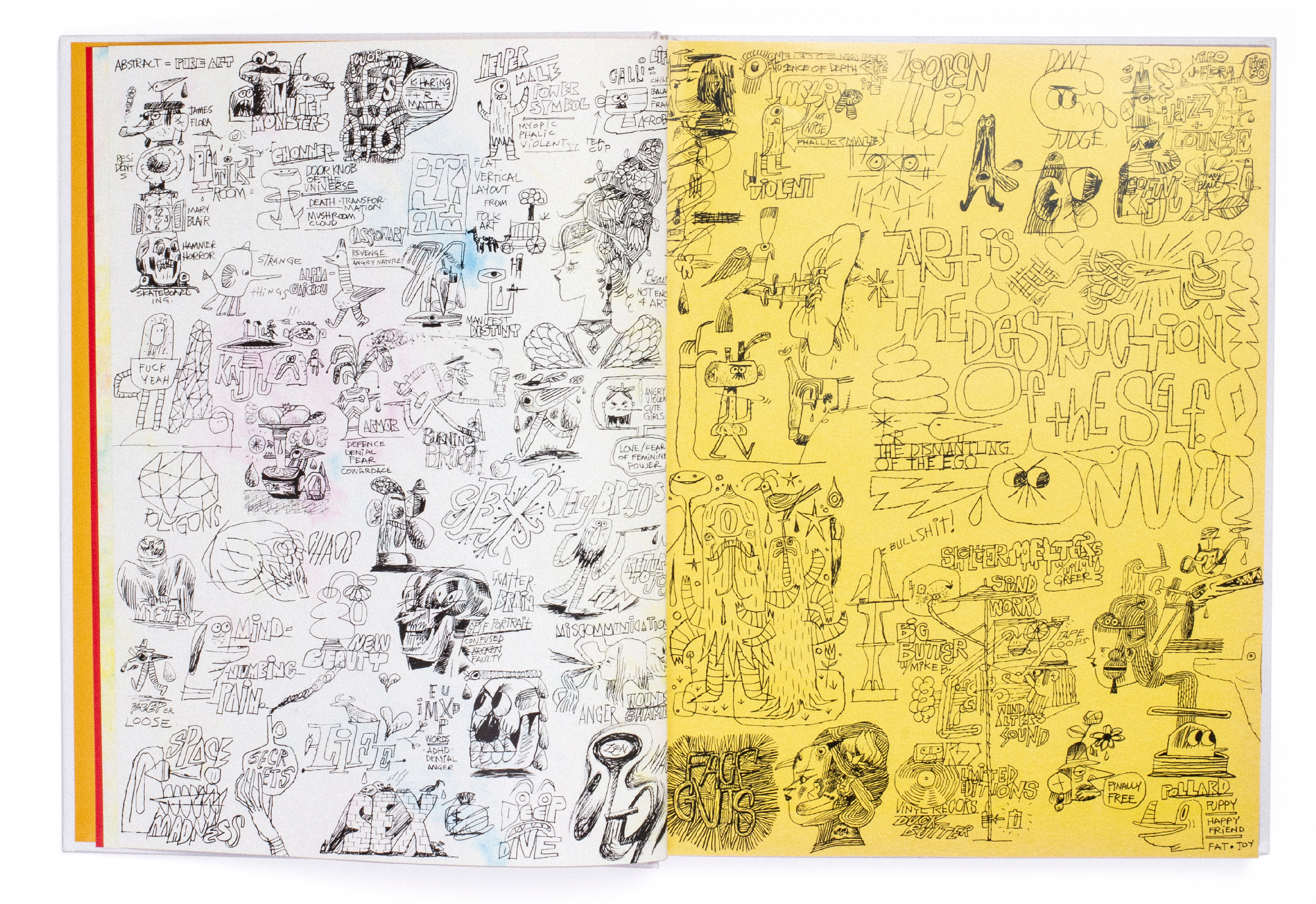
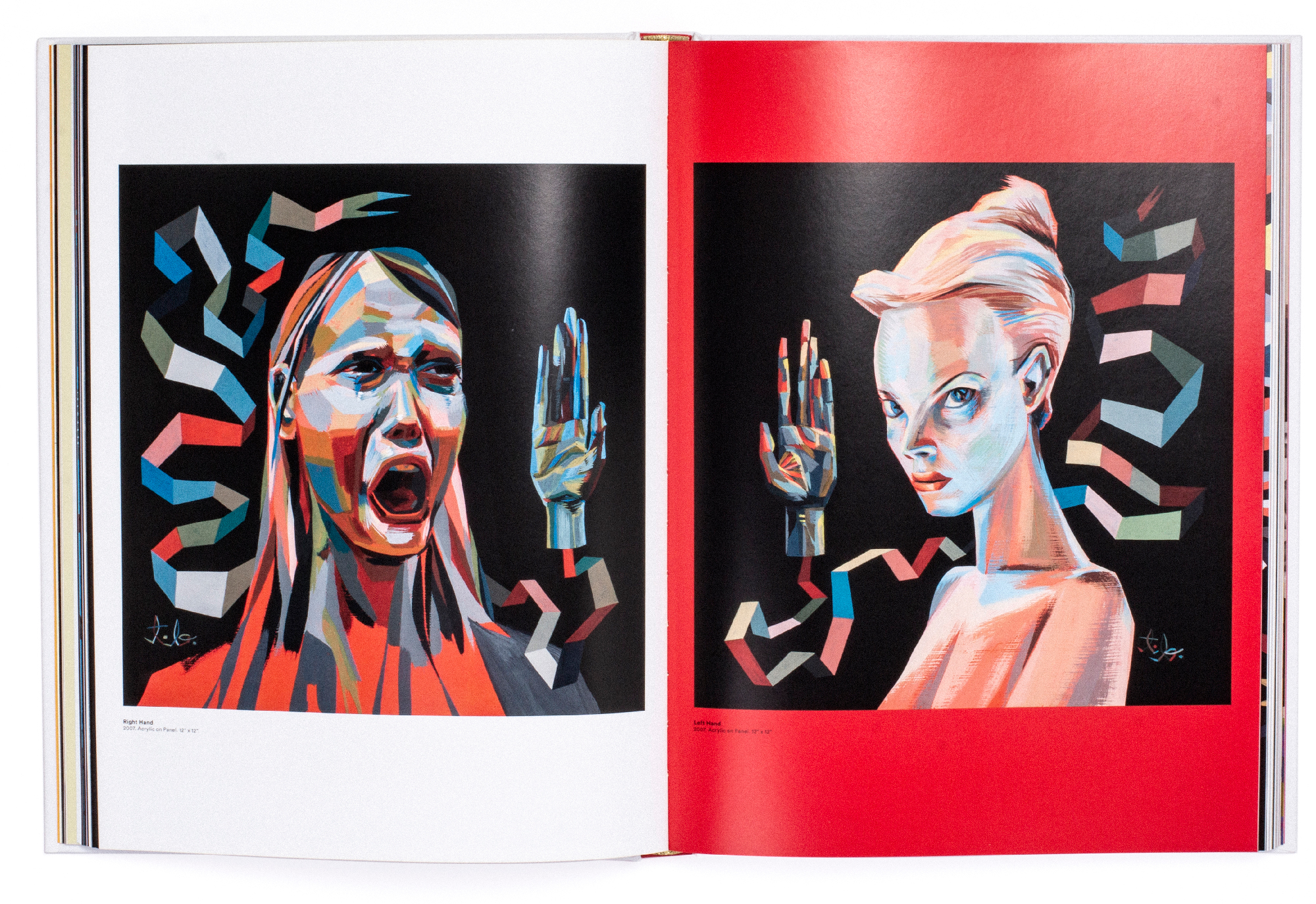
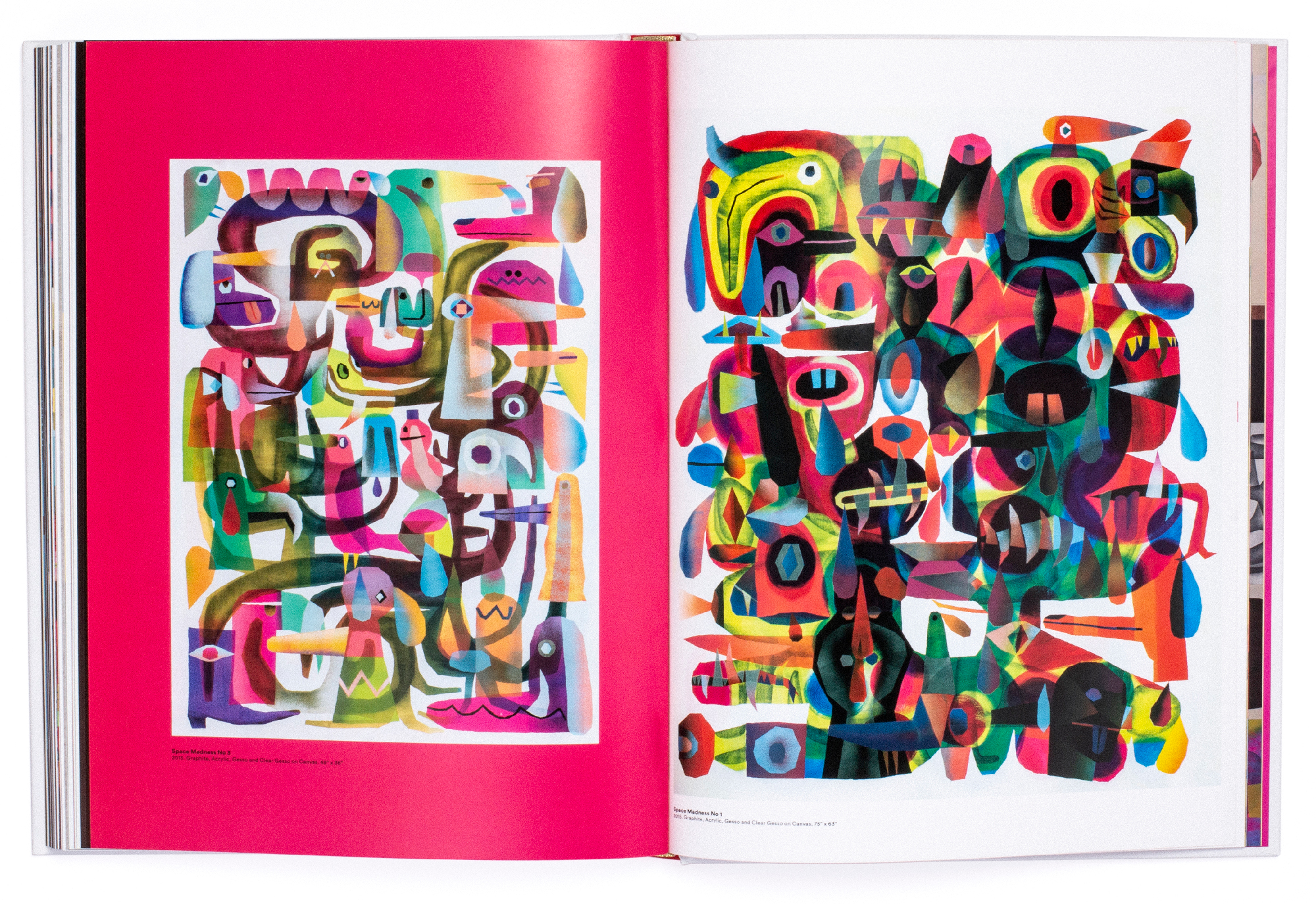
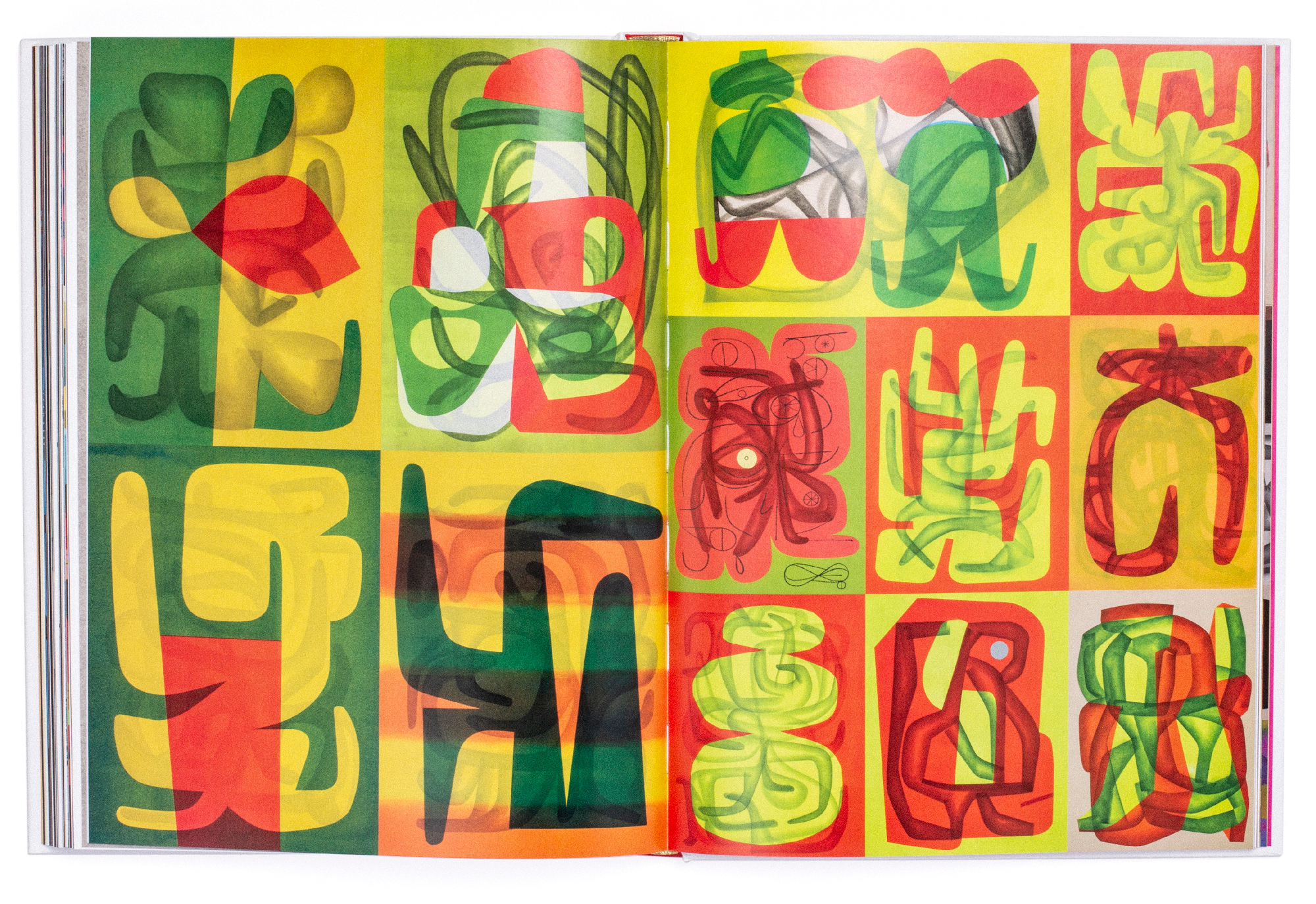
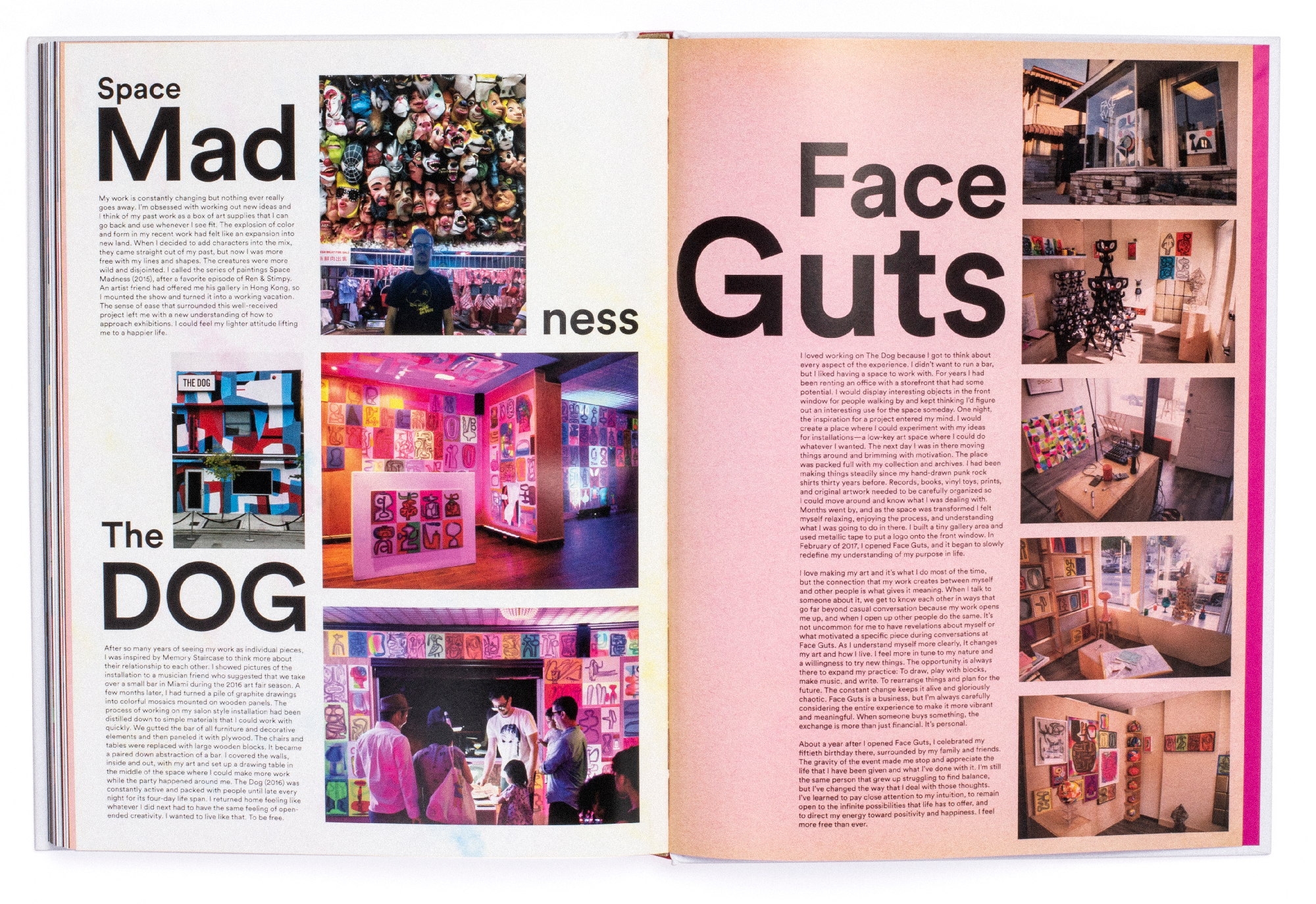
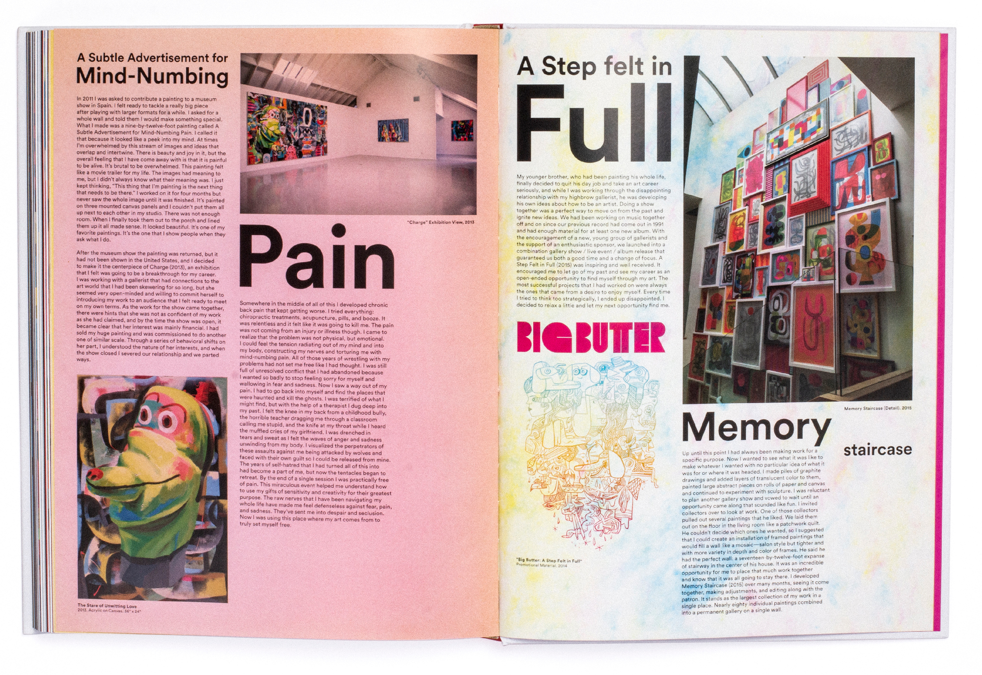
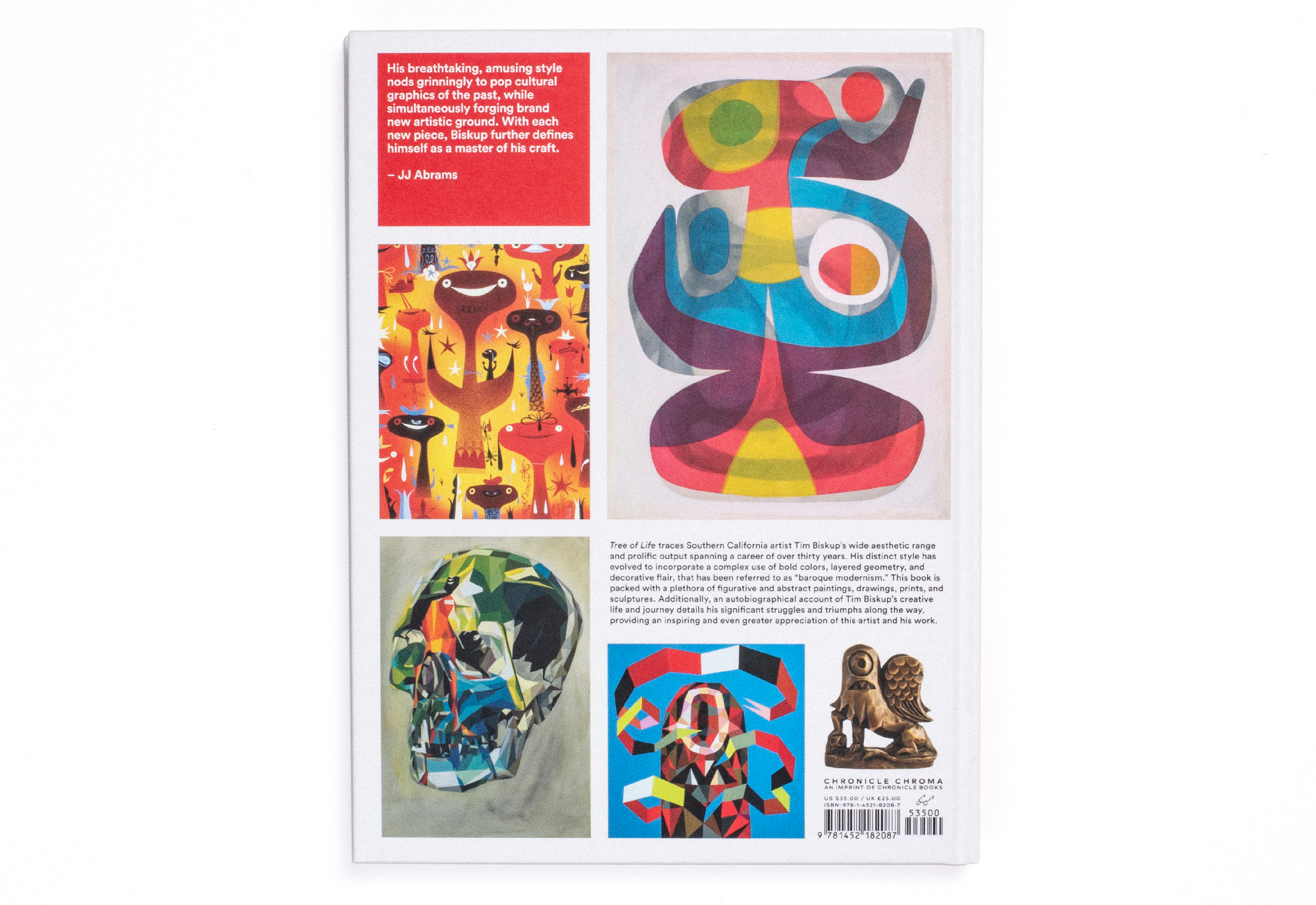
Tim Biskup - Tree of Life
For California artist Tim Biskup's first career-spanning book, the layout required simple colors and spacious arangements to compliment the complexity of the work. The narrative at the end of the book provided an opportunity to be typographically playful. Several of the early works required retouching to remove dust and scratches.
Layout
Retouching


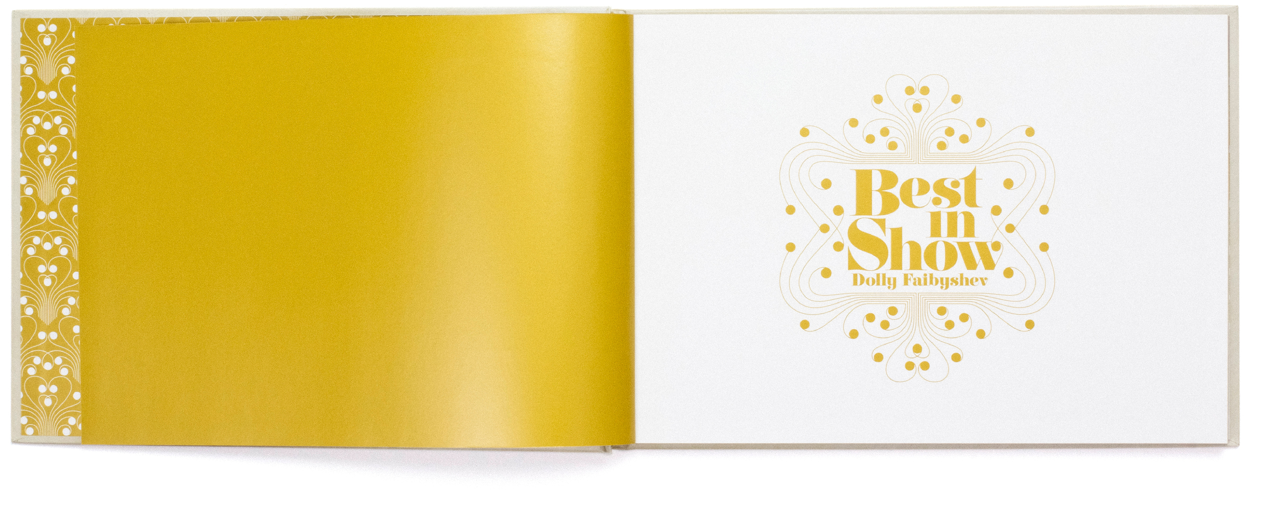
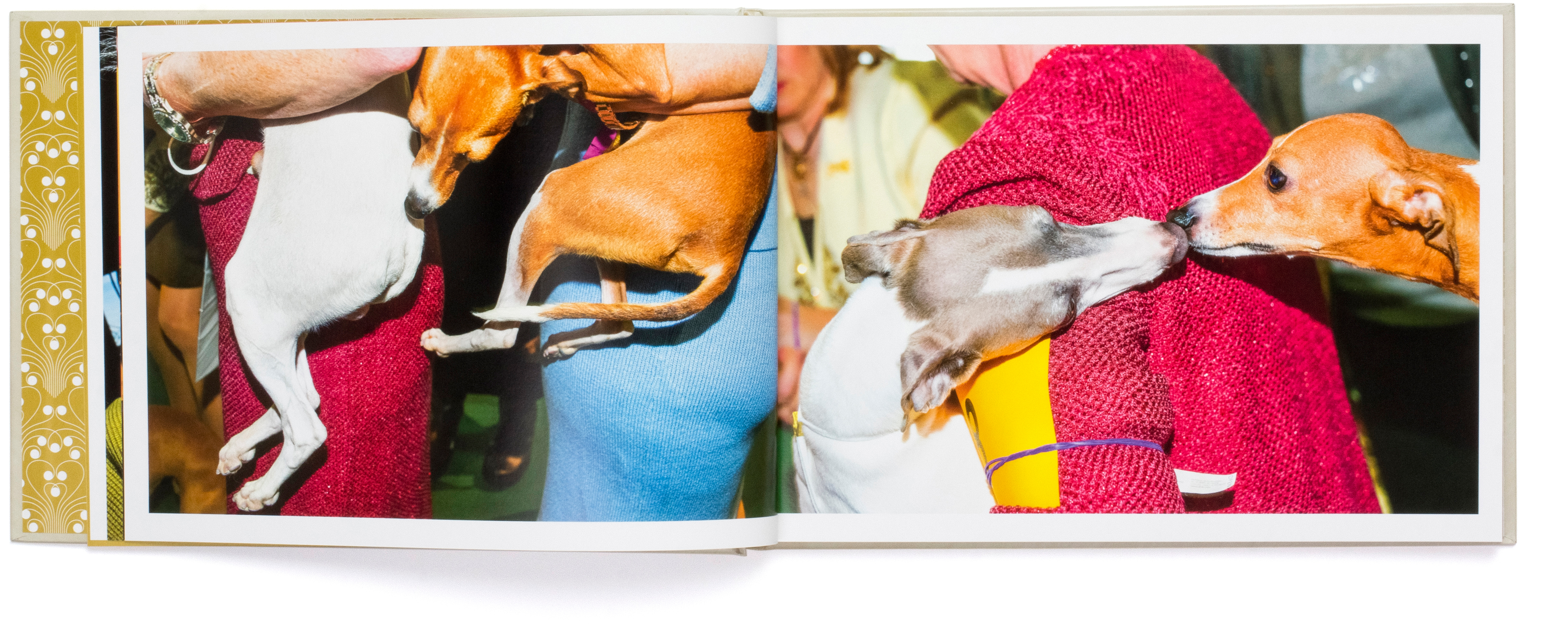
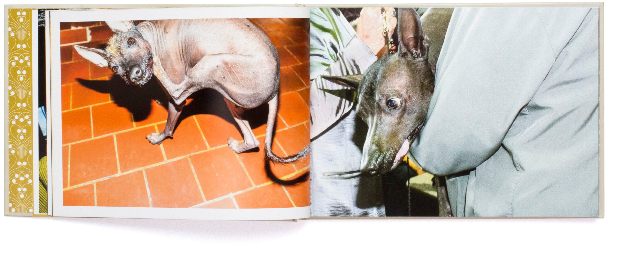
Best In Show
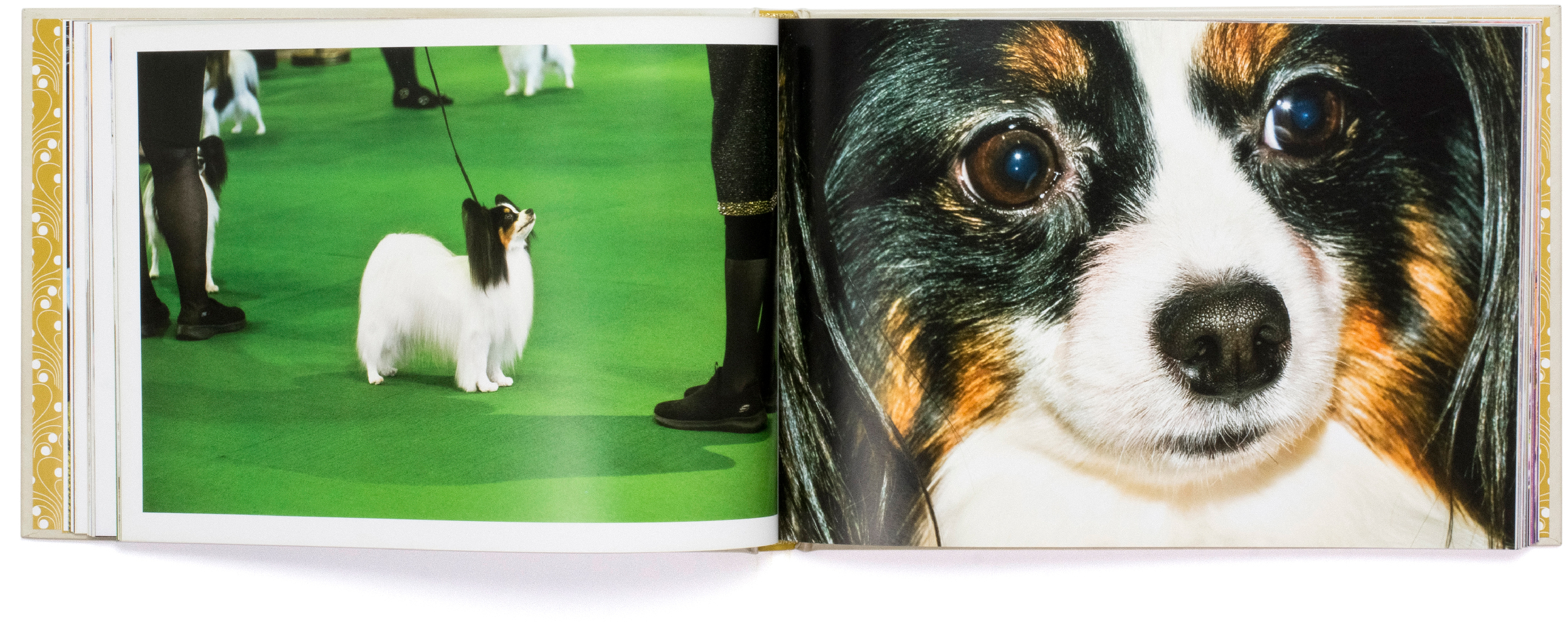
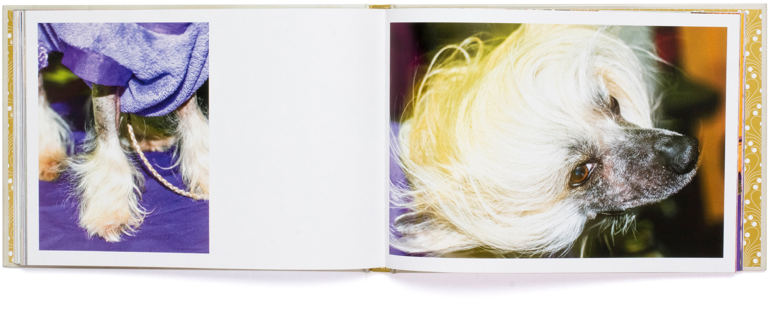
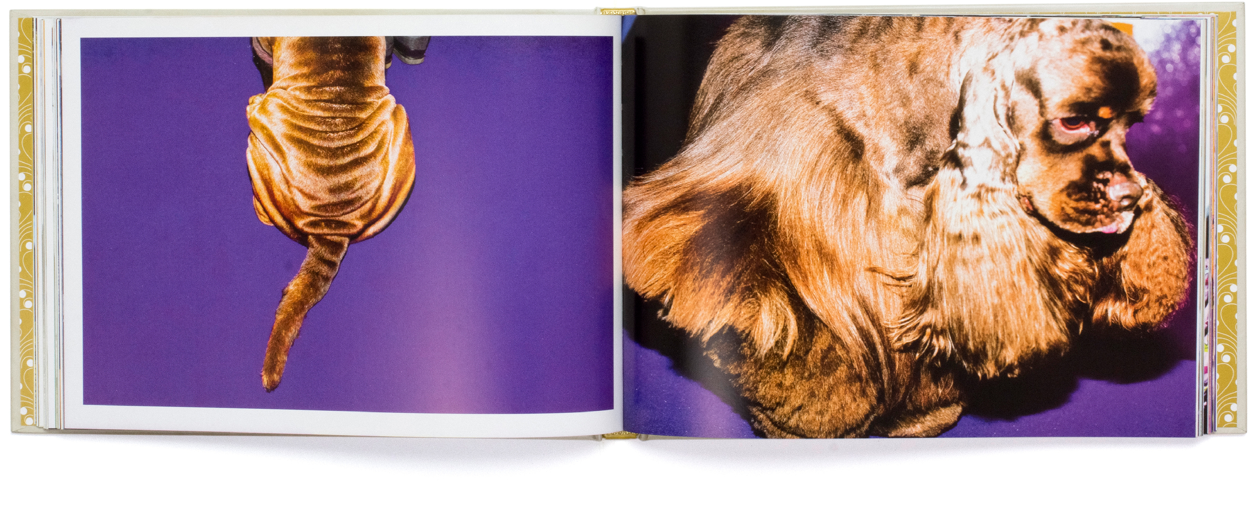
Dolly Faibyshev's images from Dog Shows focus on the unique—and often humorous—relationship between dogs and their handlers. Aside from carefully pairing the images for each page throught the book, I developed an elegant ribbon like type solution for the title and end pages.
Layout
Custom Type Design


Limited Edition
This diverse collection of art furniture required a minimal layout and clean graphic approach. The cover features the title rendered as a piece of one off furniture, and is based on the custom typeface I developed for titles and quotes throughout the book.
Rendering by Rune Spaans.
Layout
Custom typeface design
Image curation
Art direction


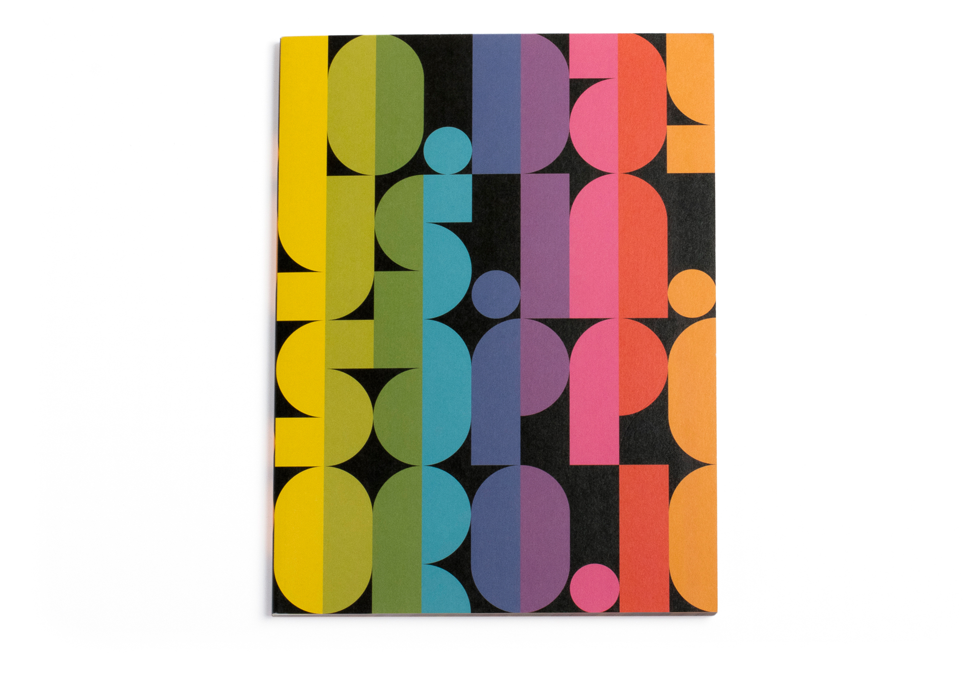
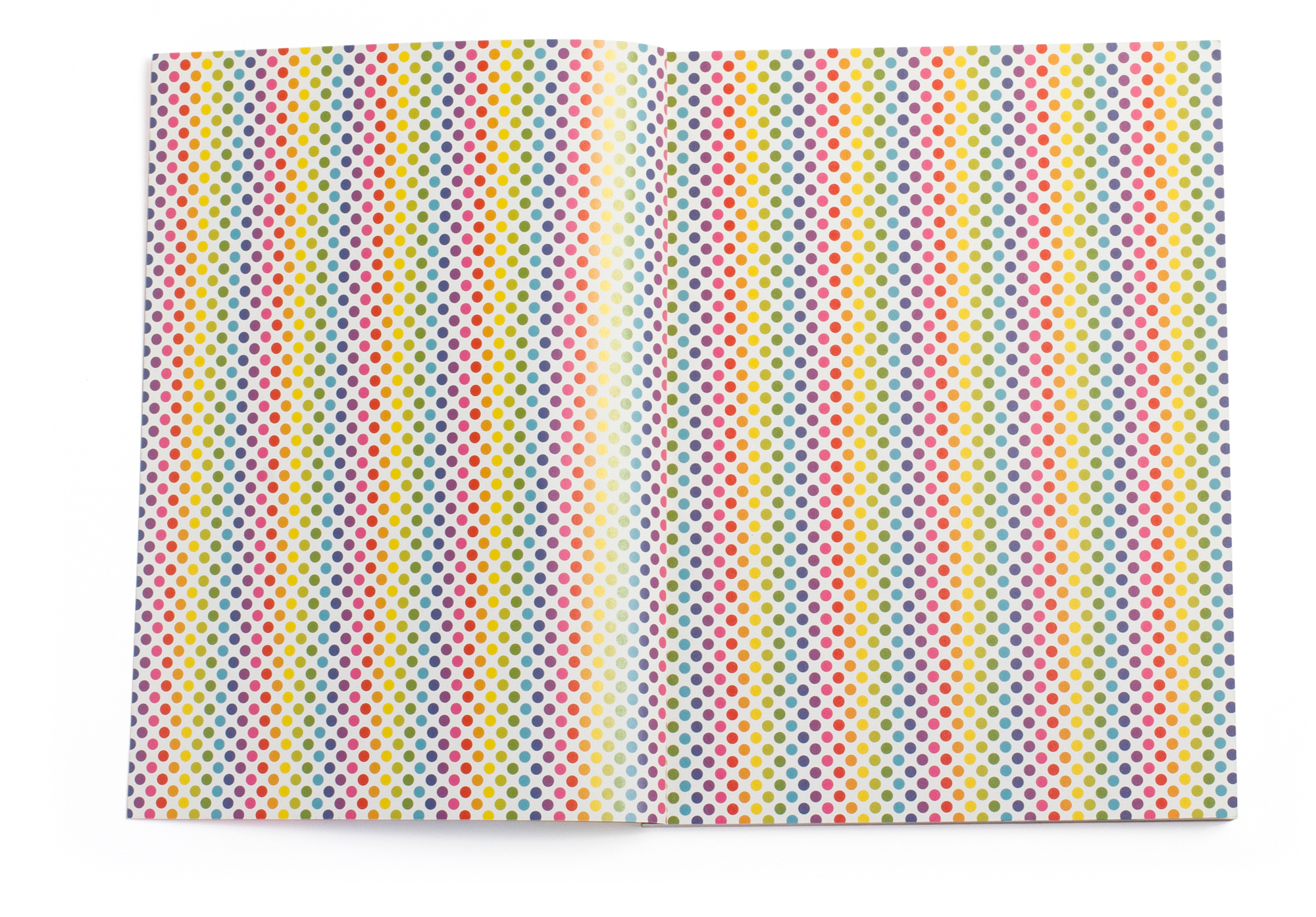
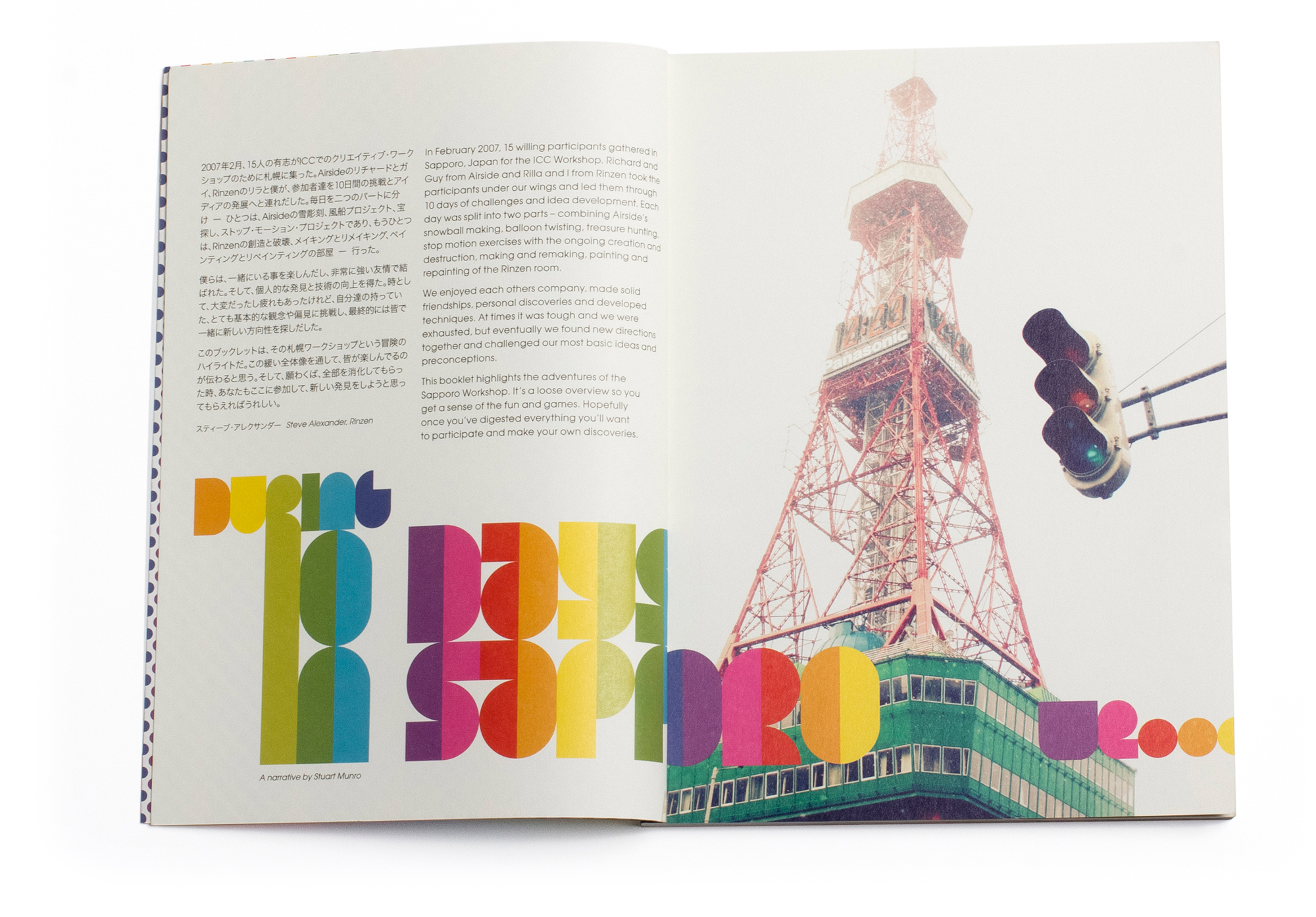
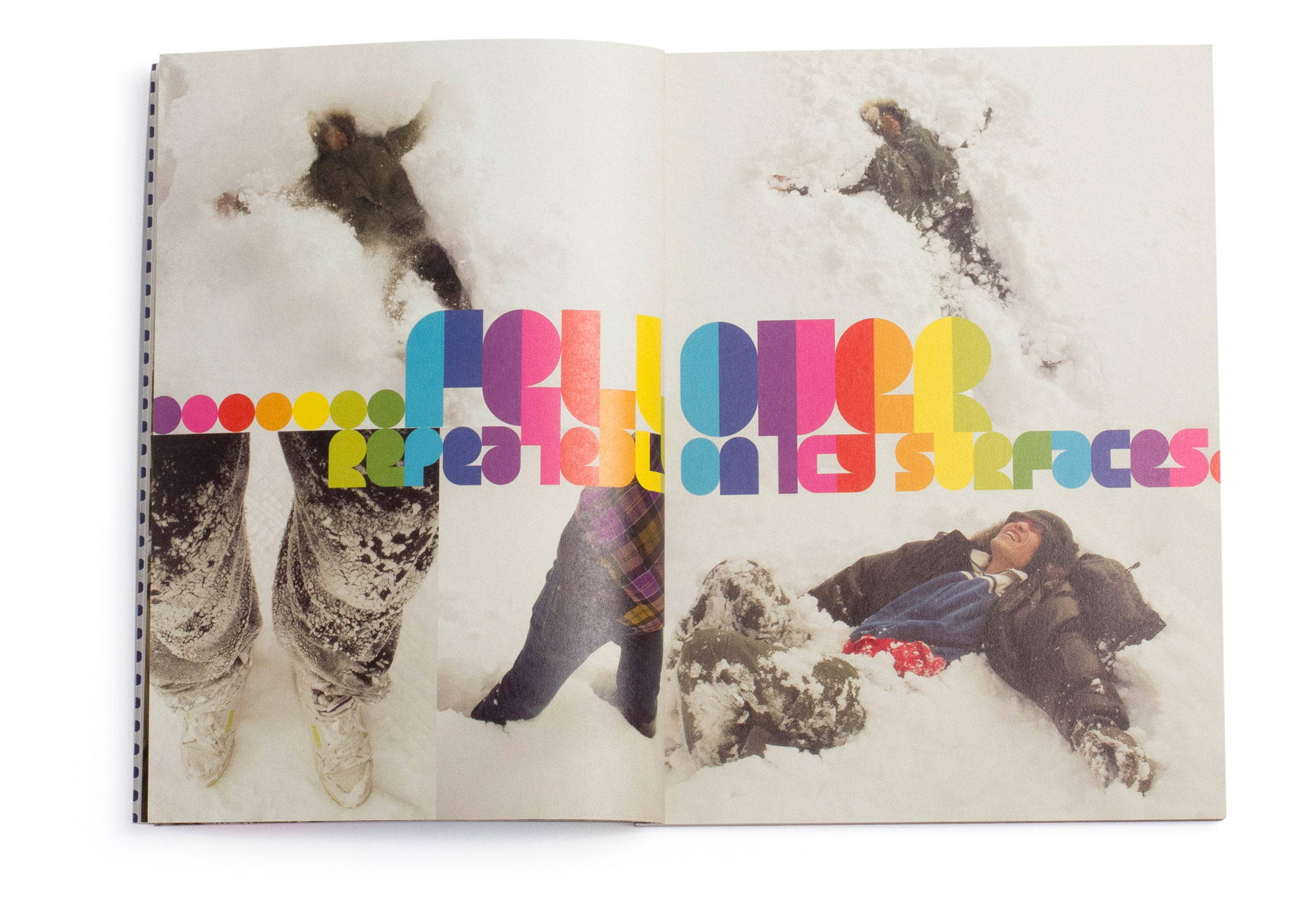
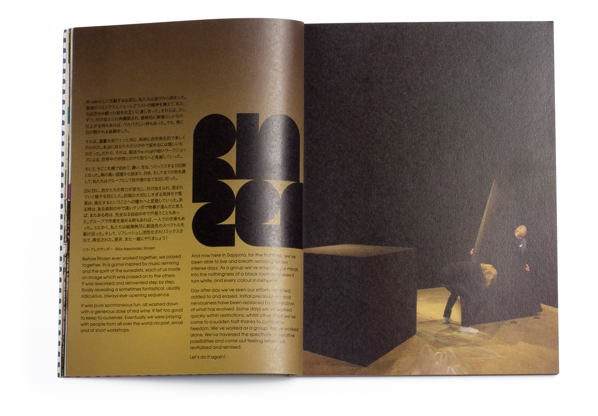
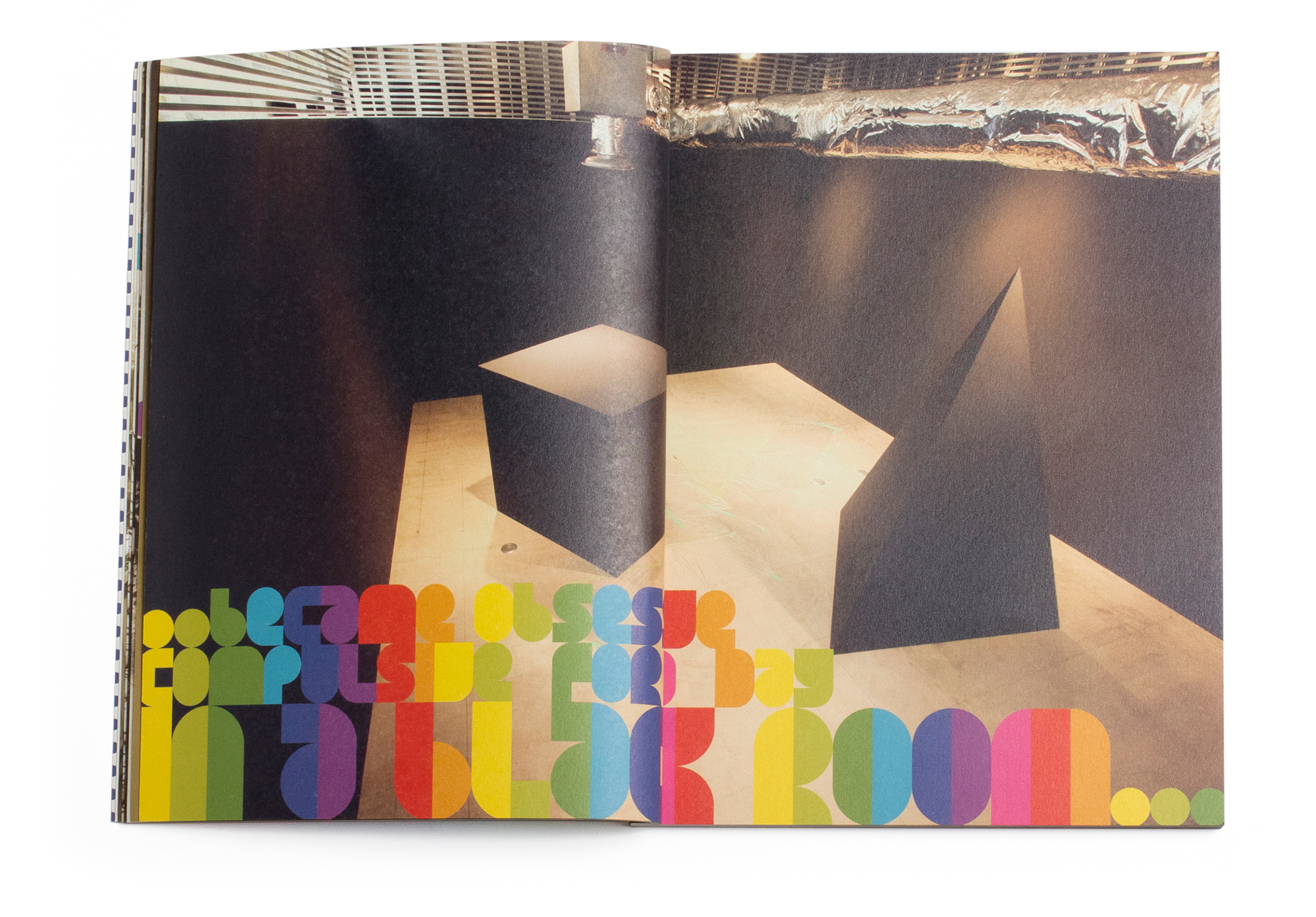
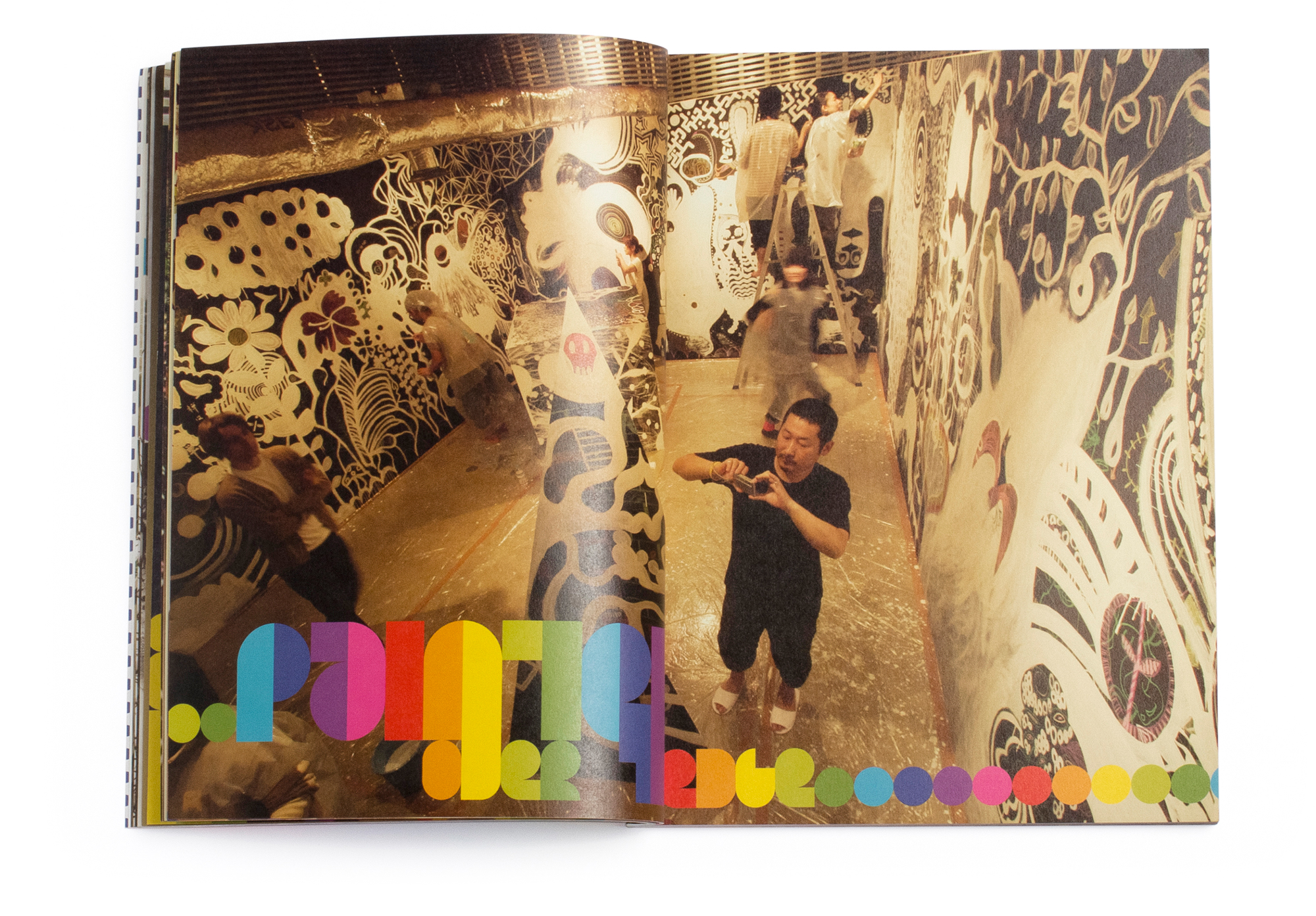
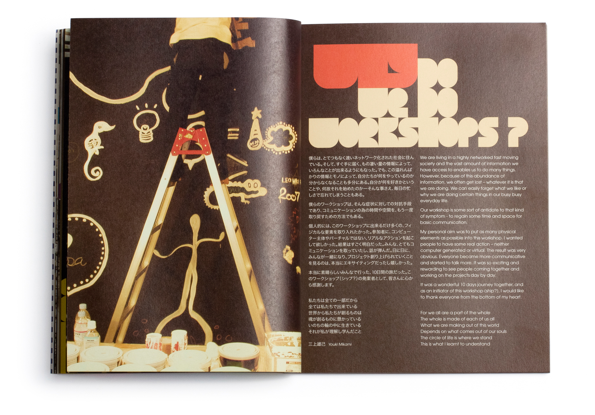
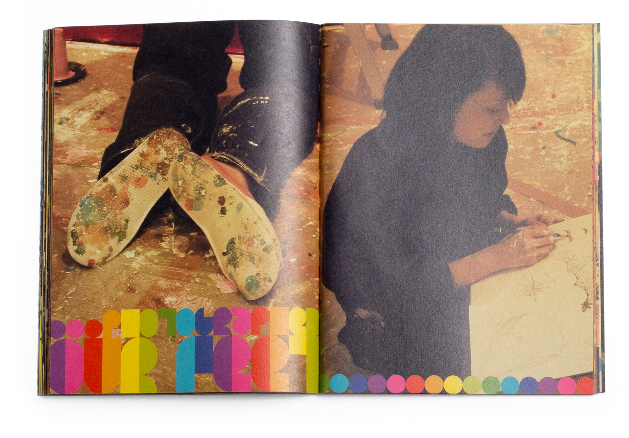
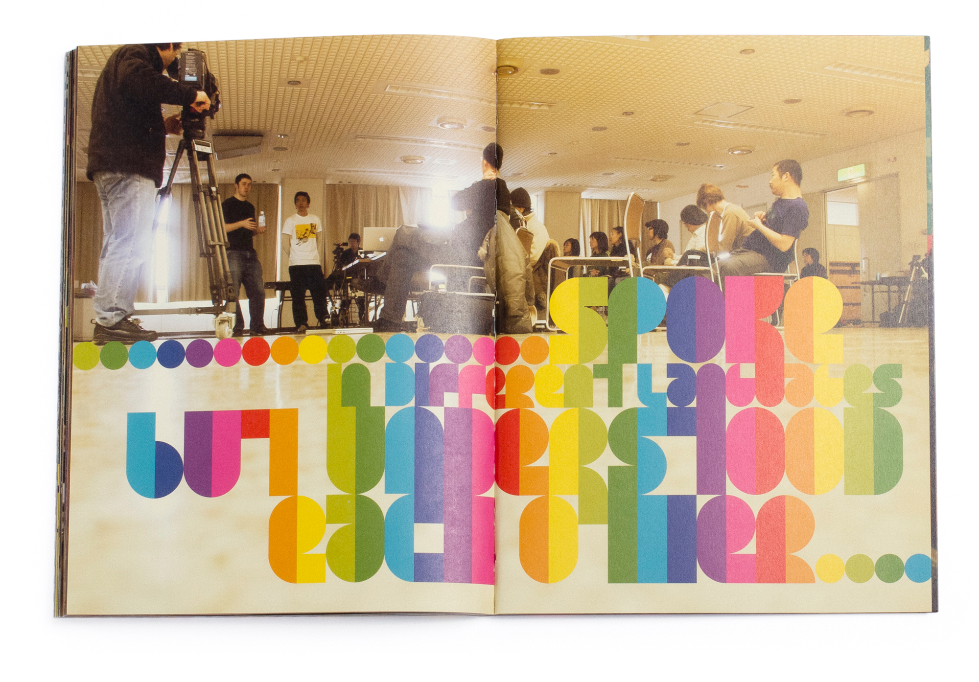
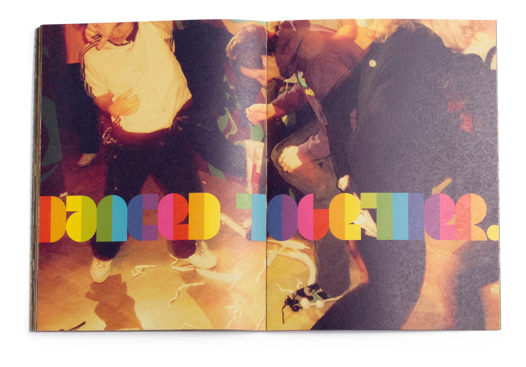
10 Days In Saporro
This compact book documents the Rinzen & Airside workshops in 2007 at the Intercross Creative Centre in Sapporo, Japan. The colorful typographic narrative that unfolds throughout, tells the story of the 15 participants working through a series of collaborative exercises over 10 days.
Layout
Custom Typography
Image Selection
Color Grading

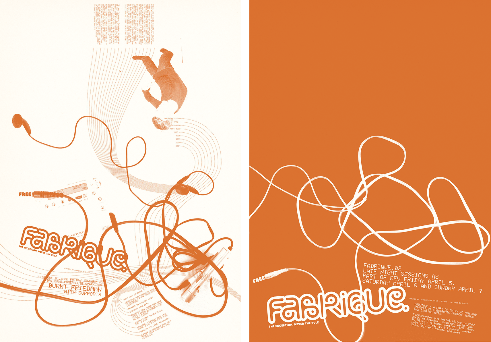
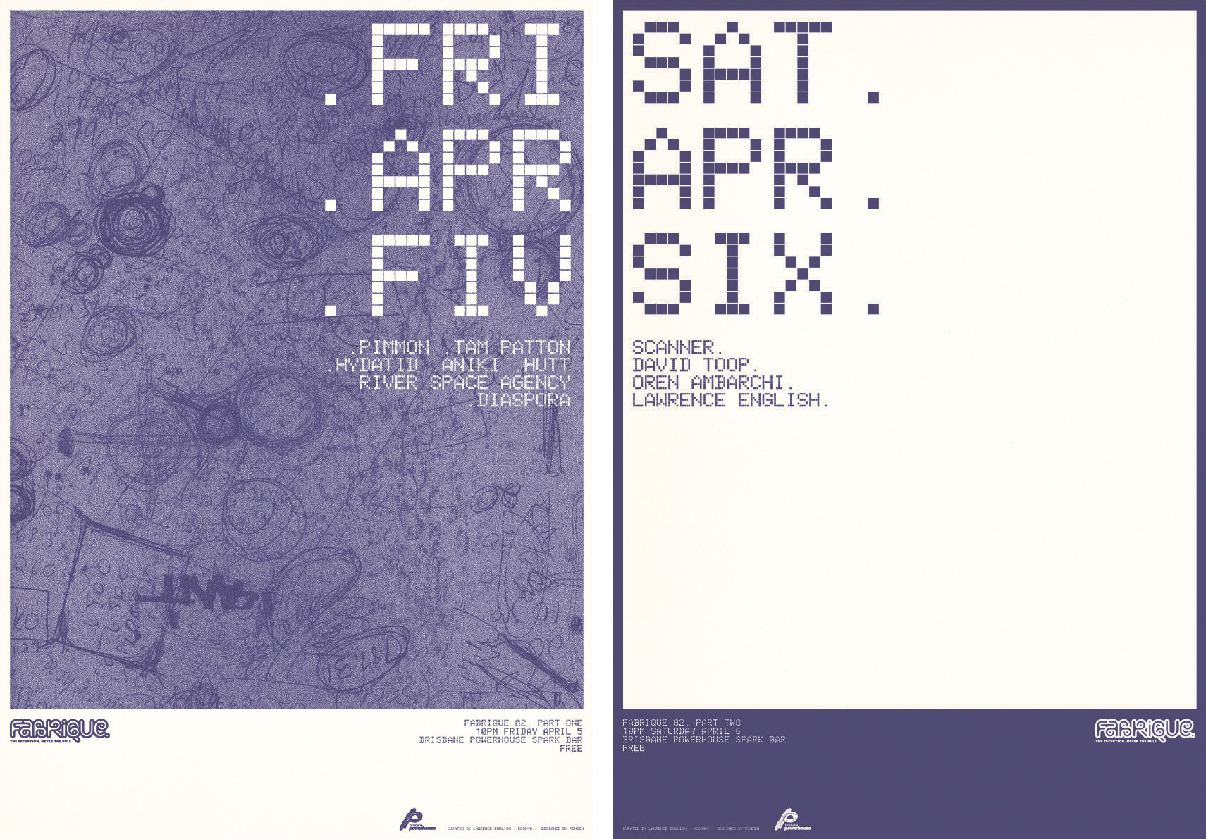
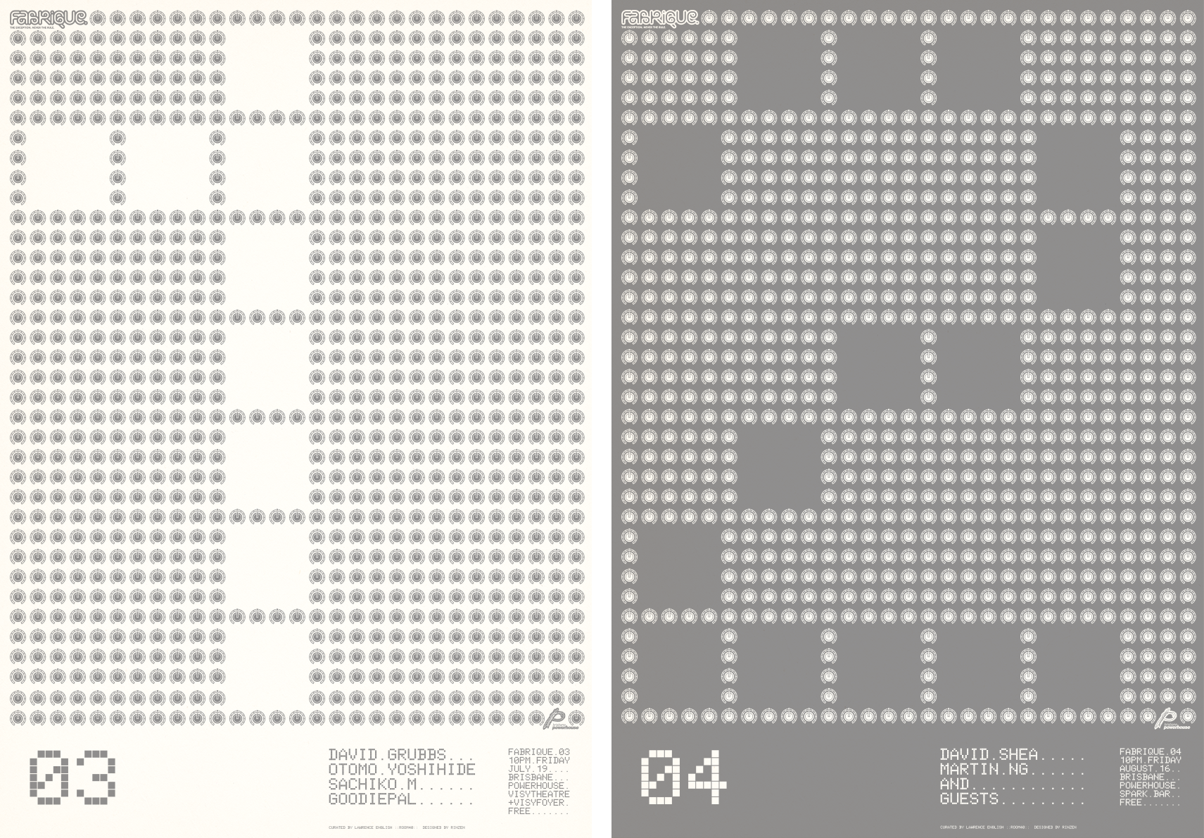
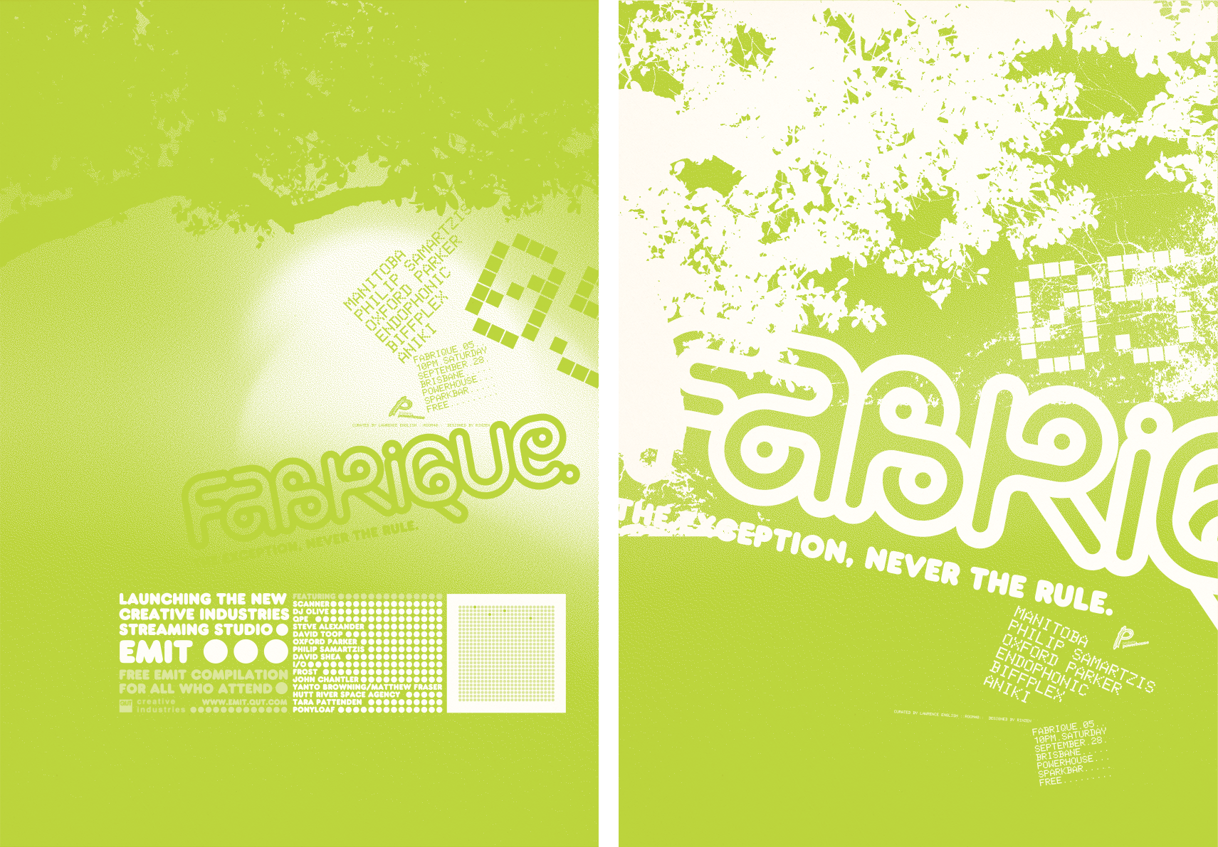
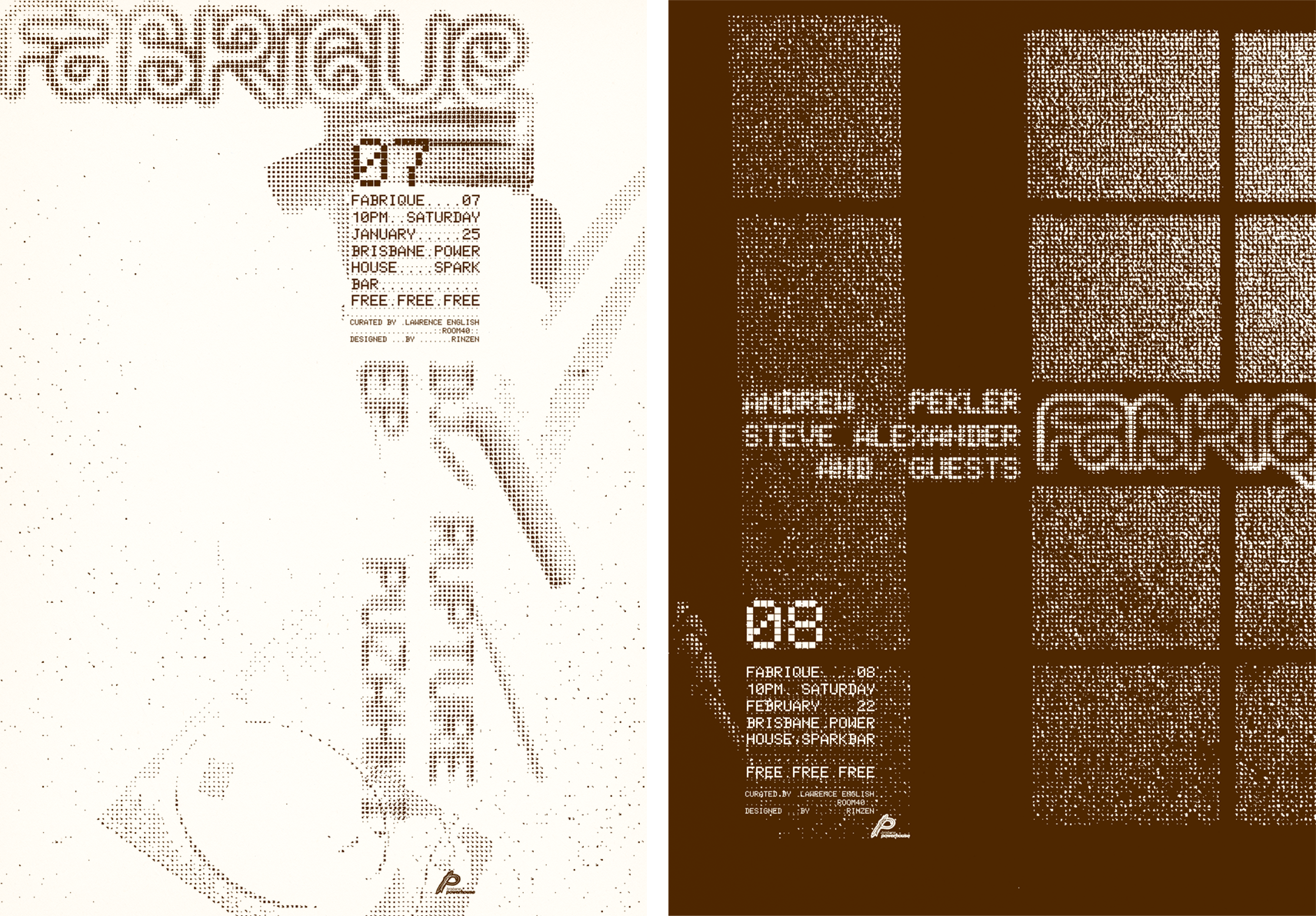
Fabrique
Fabrique was an ongoing series of free experimental musical events hosted by the Brisbane Powerhouse and curated by Lawrence English of Room40. The promotional materials I designed for each event reflect the creativity and experimentation on offer at each event. The logo I developed reflects the twisted cables plugged into equipment at an electronic music event.
Logotype
Custom font designs
Poster design
Print Production
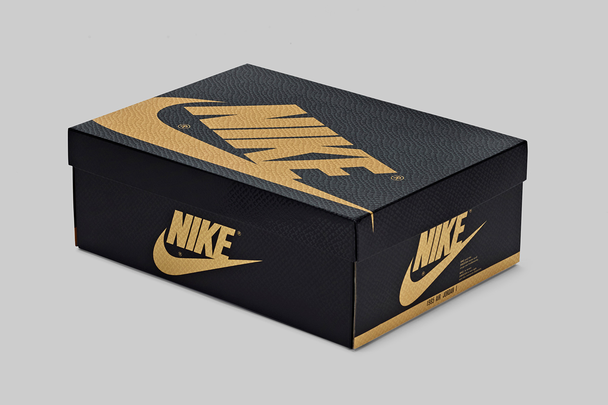

AJ1 Pinnacle
For the Jordan AJ1 Pinnacle packaging, I used a spot varnish resembling the texture of the shoe with a black and gold colorway.
Produced at Nike - Jordan
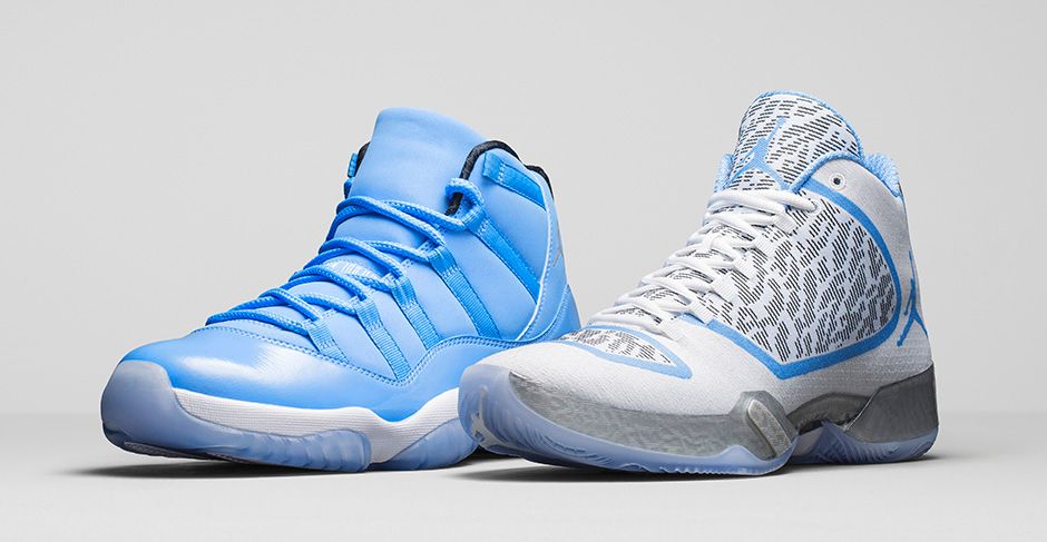
Jordan Ultimate Gift of Flight
It was a logical decision to use University Blue in the design of the packaging for the Jordan Ultimate Gift of Flight pack. The pixelated elephant print spot varnish pattern comes from the AJXX9.
Produced at Nike - Jordan


